Free resources to test how a web page displays in different resolutions. The best tools for testing responsive layout
More and more devices are available to consumers, people are more often accessing the Internet from tablets and smartphones. Search engines pay attention to sites that are “friendly” with different screen resolutions, and not just desktop. A design that is displayed correctly on any device is considered responsive.
In October 2016, Google announced changes to the search results. Previously, responsive sites were marked with a separate icon in search results as mobile-friendly. In the next few months, the separation of mobile (smartphones, tablets) and desktop (from computers and laptops) search results will begin. Therefore, if a significant part of your audience uses mobile devices, you risk losing some search traffic, if the site design is not suitable for smartphones and tablets.
Why check what a website looks like on mobile devices?
In 2015, TNS Web Index conducted an orientation study. They surveyed 60 thousand Russians in the age range from 12 to 64 years and found that 64% of Internet users also access from mobile devices. 15% of this number of people do without computers. And here is the Yandex data.
Most searched for information and content: books, music, games, etc. Therefore, it is advisable for information and entertainment sites to have adaptive design. And commercial, if you provide last-minute services: calling a tow truck or locksmith, emergency opening of locks, pizza or sushi delivery.
Virtual website hosting for popular CMS:
Adaptability will not be superfluous for any resource, because mobile audience is growing and no decline is expected. According to the same study, some users are already doing without desktops. A search robots they lower “non-rubber” sites in search results. Exception: resources with a low share of mobile traffic.
There are other ways to please users different devices, for example, creating mobile version site. This is convenient for visitors because the site is not overloaded with unnecessary graphics and content. If the webmaster makes significant changes to the code, this will not affect the main site. But there are also significant disadvantages.
- Layout of the second site will be much more expensive than adapting the old template.
- Different addresses of the mobile and standard resource split the traffic into two streams.
- It takes more time and money to support two projects.
It’s worth making a mobile version when the vast majority of traffic comes from phones and tablets: if you social network or entertainment portal. In other cases - adaptive design.
How to check what a website looks like on a tablet or smartphone?

The tools of the online services Yandex.webmaster and Google include special utilities, which analyze the site and indicate where to look for problems.
You can see with your own eyes how the site looks for mobile device owners in all popular browsers. For Firefox, viewing is called by the keyboard shortcut Ctrl+Shift+M.

IN Google Chrome To view, press F12. We stretch the window with the mouse or set required resolution in numbers.

If you are looking for hosting for a certain system content management - take a look at our page.
Online services for checking what a website looks like at different resolutions.
You can check how the site looks at different user screen resolutions using online services.

- Mobile - 320x480px;
- Tablet - 768x1024px;
- Laptop - 1280x802px;
- PC - 1600x992px.

Compared to the first service, the functionality is better. Shows permissions:
- 10 mobile;
- 9 tablets;
- the same number of PCs and laptops;
- If the desired option no, we set the parameters from the keyboard.
Be sure to watch from a mobile phone, on different versions of Android.
Such services are just an imitation. It happens that there are no design problems on them, but on android device layout floats. Font metrics, button sizes, display of some css\html tags are specific to different operating systems and browsers.
It is imperative to look at what the site looks like on real devices and whether it is possible to perform targeted actions on them. It happens that the site looks great, but the order form does not work.
But not always at hand necessary tools- not everyone at work is given an iPad, iPhone and a couple of Android devices. You don't have to search everything possible options, but it’s better to check at least on those devices from which you are most often visited.
If there are none, ask a friend for the required model or test it at the nearest store. Otherwise, you risk losing a considerable part of your traffic. Information on the site’s audience, the most popular resolutions and operating systems we get it using the same Yandex.metrics.
I was faced with the need to view the site at different screen resolutions. With the development of smartphones and the emergence of many different sizes screens it is useful to see how your site will look on a particular device. There are several options to solve this problem. To view the site on your computer at lower resolutions than your monitor, just go to the screen settings and select the desired value.
There is also the option of using browser plugins, for example Web Developer for Firefox, which also exists for Google Chrome. The Resize option allows you to resize the browser to the size you need.

These methods are the simplest, but now they are no longer enough - viewing the site on larger screen resolutions or seeing how it will look from a mobile phone will not work. I remember recently I was looking at a project that would allow testing sites in all browsers. It is extremely useful for testing cross-browser layout on different OSes and browsers, but there were not many screen resolutions there. In addition, you had to register to use it. Today I’ll look at a couple of simpler and available services For quick view site on different screen resolutions.
Services for viewing a website at different screen resolutions
Some projects only allow you to change the screen resolution, while others have additional functions. I won’t look at them in detail, I’ll just mention them in the review, maybe you’ll find them useful.

By the way, the quirktools.com domain hides a couple more interesting simple services:
- Smaps - creating site maps or simply a hierarchical diagram.
- Wires is a cool thing that allows you to create web page layouts using different functional blocks (text, tabs, forms, buttons, etc.)

The simplest possible service for viewing different screen resolutions. There is also a list of the most popular devices from which you need to choose yours.

The project has a very nice design.
This service is similar to CrossBrowserTesting, since it additionally allows you to evaluate your site for different browsers and OS. Moreover, it also requires registration and has paid functions. Although this is not necessary to view different screen resolutions, go to the Responsive menu item.

In terms of design and functionality, everything is very cool, just worth mentioning is the ability for smartphones to select Portrait and Landscape viewing options. Yes, other services have a Rotate function, but, you see, everything looks much brighter this way. By the way, if I understand correctly, then after registration you will be able to use the option of live interactive testing in real time.
Service in the spirit of minimalism. There is a field for entering the name of the site + the ability to select screen sizes for viewing.

Another extremely simple project. In addition to the site address and sizes, the most popular screen resolutions are presented for your convenience.

If you look closely at the bottom of the picture, you can see that the InfoByIp service shows the presence of a bottom scroll bar at a resolution of 1024x768. If you change the monitor resolution manually, you can see that there is no scrollbar there. Such inaccuracies in some services are a little depressing; you won’t use a ruler to measure the reliability of the displayed result. That is why I advise you to view the site at different screen resolutions, using a couple different services just in case.
Stop resizing your browser window, stop raping it! I bet you've heard this more than once. Okay, maybe you haven't heard of it. But if you develop responsive websites professionally, you know what I mean: any DOM change or CSS edit, and you again start pulling the edge of the browser back and forth, testing the changes and seeing if anything is broken.
The purpose of your movements is to imitate the screens of various devices.
In a corporate environment, you often have a variety of gadgets provided by the company for testing. At my job, I have an iPad, iPod, other tablets, laptops, and desktop monitors at my disposal. If you don't have that luxury, you have to use what's on hand.
Fortunately, there is an impressive set online tool ov, simulating different diagonals of devices. Of course, each of them has its own advantages and disadvantages, we will look at several of these tools.
For testing, I chose the truly responsive website PajamasOnYourFeet.com, the site is built based on an HTML5 template provided free of charge by EGrappler.
Am I responsive?
Am I Responsive, a very simple tool that allows you to quickly view your site on up to 4 devices. All of them are iOS and the developer explains this as a feature of the site. In general, no settings, no choice, but very simple and clear.Available sizes:
- desktop monitor - 1600 x 992px;
- laptop - 1280 x 802px;
- tablet - 768 x 1024px;
- mobile phone - 320 x 480px.
There are two nice features: the ability to drag devices across your screen, and the ability to share a link to a site test.

device positive
deviceponsive is very similar to Am I Responsive, in that it is just as simple, with a minimum of settings and options. All available devices are displayed at once on one long page. Of all the available options, this is the ability to edit the header background and add your logo there, which will be useful when you decide to share a screenshot.Devices and available screen resolutions.
- Macbook - 1280 x 800
- iPad portrait - 768 x 1024
- iPad portrait - 1024 x 768
- Kindle portrait - 600 x 1024
- Kindle landscape orientation- 1024 x 600
- iPhone portrait - 320 x 480
- iPhone landscape - 480 x 320
- Galaxy portrait - 240 x 320
- Galaxy landscape - 320 x 240

responsive test
Like deviceponsive, responsive test displays your site in various devices. But instead of showing everyone at once, you choose required device V top menu pages. By the way, scaling works correctly here, which allows testing higher resolution on less.30 different resolutions are available on the site, ranging from a huge desktop monitor, to what they call "crappy android" (to be fair, there is also a normal android).
As for the Firefox browser, it does not work correctly with this site. Note that the screenshot does not show the slider between the green header and the white background content area.

responsive.is
Very similar to the previous two tools, but there is one thing that sets responsive.is apart from the others. This smooth animation when moving from one device to another, as well as a semi-transparent area that shows the real area of the site that does not fall into the viewing area.Available device options - car (as you see the site), desktop computer, tablet in landscape and portrait orientation, smartphone in portrait and landscape position. Unfortunately, it is not possible to set arbitrary sizes in px.

Screenqueries
But here are the possibilities available options differentiate Screenqueries from previous services. 14 phones and 12 tablets are presented here, with a separate opportunity switch to portrait and landscape mode. The results are displayed on a grid with rulers. It is also possible to set a custom resolution by dragging the right or bottom edge.An interesting feature of this site is that for a number of devices there is a “Trueview” option that shows your site in the device’s native browser.
Unfortunately, Firefox was unable to display the slider here either. No need to blame me, Firefox is my favorite browser, but that's the way it is.

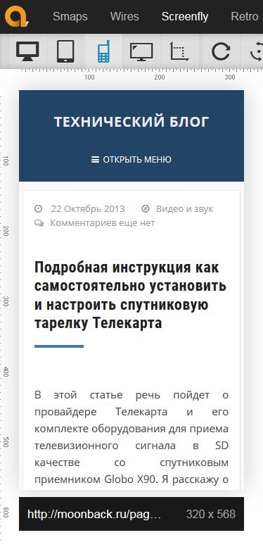
Screenfly
Screenfly is perhaps the most functional of all. There are 9 more than tablet devices available - from 10" laptops, to 24" monitors, 5 tablets, 9 phones, 3 TV resolutions, as well as custom resolutions. Add here a separate switch for portrait and landscape mode, as well as an option to show scrolling. You can also share a link to the test using one button.For each device, the screen size in px is indicated in the menu, as well as in the right top corner The actual size of your browser window is displayed.
All of the above advantages allow us to claim leadership, if not for one thing (quote from the developer): “Screenfly can use a proxy server to imitate devices while viewing your site. The proxy mimics the user agent string, but not the behavior of these devices." Screenfly is the only service on the list that allows testing based on the user agent string.

Do you use the presented tools in your practice? Share your secrets of developing responsive websites in the comments.
P.S. Please report any errors regarding translation via PM.
People involved in website development usually need to test how site layouts will display on different screen resolutions and web browsers. It is difficult to track the display of a website on different devices with different screen resolutions. Luckily, some online sites offer a great tool for checking page layout at different screen resolutions.
These websites display preview web page by entering the site URL. If you want to see how your web page will look in different screen resolutions, you can try these free resources, easily checking compatibility with different screen sizes.
Some of these sites offer a wide range popular resolutions desktops, laptops, TVs, tablets and mobile devices, others provide the ability to manually enter the resolution and check the page layout at a specific resolution.
Although all the tools are simple and easy to use, they have their own set of advantages when compared to each other.
First place can be taken - very good service for online testing of a website in various resolutions that is clear and attractive user interface. On the site you will find various screen resolution options, including desktop computers, netbook, laptop, tablets, TVs.
It is possible to select the device name directly if you do not know its exact resolution. So you can select Kindle, Google, Samsung, Motorola, Apple from the dropdown list and check the page layout in the corresponding resolution.
In addition, Screenfly allows you to set a custom screen size in pixels and allow you to apply it to your page. This way you can easily check web pages in almost any resolution.
Additionally, you can rotate the screen, enable or disable web page scrolling, or use a proxy server to test the web page.

Other free online resource, where you can easily check the site in different resolutions. On the site you will find a good range of devices from desktop computer, laptop, tablet to smartphone. In addition, it also allows you to manually enter resolution and check page layouts.
There's also an "in browser" option that leaves room for browser borders and controls, as well as the taskbar in the preview window.

Next comes another free tool, which allows you to test the site in different resolutions. It is possible to choose from the proposed resolution options or enter your own dimensions for the site.
This site offers two various options display: windows and frames. The window option works well with low screen resolutions, however, if the selected resolution is larger than the screen size, you can use the frames option to check its compatibility with the screen size.
also detects your screen's current resolution and displays it for your reference.
Another web tool that allows you to test website pages in various sizes. The site works best with Internet Explorer and displays web pages in the selected resolution. However, the list of permissions is very limited. This means that you can check web pages in only 8 resolutions, including 800×600, 1024×768, 1280×960, 1440×900, 1600×1200, 1680×1050 and 1920×1200.
Doesn't have as many options as other similar websites, but it's worth a try.

Last on the list is TestSize.com, a free online tool that offers 9 different page test resolutions: 240 x 380, 640 x 480, 800 x 600, 1024 x 600, 1024 x 768, 1280 x 600, 1280 x 1024 , 1366 × 768 and 1920 × 1024.
In addition, here you can also enter screen sizes manually and check the website in a separate window that opens (Open popup). TestSize.com is convenient and easy to use.
Leave your comment!
Today there is no longer any need to convince anyone of the need for a mobile version of the site. After all, every day there are more and more visitors from smartphones and tablets. As of this writing, about 20% of my blog visitors use a mobile device for browsing. That is, every fifth person visits my website from a phone or tablet.
A few years ago, I didn’t even think about such visitors, but when their number exceeded 10% of the total, I began to use adaptive layout. This made it possible to display content correctly on mobile devices and increase loyalty to the site for both visitors and search engines.
A mobile version of a website and responsive design are not the same thing. This article will focus on testing adaptive layout, when the site design changes depending on the screen resolution of the visitor’s device.
To be sure that your site displays correctly on mobile devices, you need to check, and for this there are several useful services and tools.
Quick check of adaptive layout
Popular Internet browser (browser) Mozilla Firefox equipped with built-in tools for checking website design for suitability for display on mobile devices. To use it, go to “Menu” - “Development” - “Adaptive Design”. Or just press three keys on your keyboard at the same time ++[M]
You should see something like this:

By changing the screen resolution and orientation, you can check how your site will be displayed to mobile visitors.
Google Browser Chrome It also has built-in support for checking the adaptability of the site design. To do this, go to the menu, select “Additional tools” and then “developer tools” (or press ).

After that, click on the responsive design icon (or simultaneously press on your keyboard ++[M]):

In the middle of the screen you will see how your site will be displayed on mobile device screens:

SEO testing of mobile design
As you know, the two world search leaders Google and Yandex have their own immodest opinion on how a website should look on mobile device screens. And if a site is deemed inconvenient for mobile visitors, then it is downgraded search results. Thus, from the point SEO perspective, if you don’t want to lose mobile visitors, then not only must you have a responsive design, but search engines must also consider it as such, that is, suitable for mobile devices.
To check adaptability using Google service go to the following address and enter the name of your site: https://www.google.com/webmasters/tools/mobile-friendly/.
This is what the result of checking my blog looks like:

With Yandex it’s a little more complicated; to check, you must register with the Yandex.Webmaster service and use the beta version of the interface:

Online services for testing adaptability
The main task of these services is to present (show) what your website will look like on mobile device. There are a great many sites with such functionality. I will give just a few of them. In most cases, they duplicate the built-in functionality of FireFox and Chrome.
Google resizer
I’ll start again with Google, which has its own service for demonstrating adaptability: http://design.google.com/resizer/#

Quirktools screenfly
The second nice service is http://quirktools.com/screenfly/. It will show you how your website can look even on TV!
Symby.ru adaptest
Well, in order not to offend the “domestic manufacturer,” I’ll give an example of another site: http://symby.ru/adaptest/. On one page you will see several views with different screen resolutions.

Speed of the mobile version of the site
Once you are sure that your site is responsive and displays correctly on most devices, you should check its speed. Again in relation to mobile visitors.
PageSpeed Insights
Google, as always, is ahead of the curve: https://developers.google.com/speed/pagespeed/insights/. This service will show you what the site looks like on a phone screen and give recommendations for optimizing the code to increase loading speed on mobile devices.

WebPageTest
And in conclusion, I will give an example of a service that will not only show what a site looks like on a mobile device, but also show its speed: http://www.webpagetest.org/

conclusions
In my opinion, in everyday work, when making changes to the site design, it is easier to use the built-in capabilities FireFox browsers and Chrome. After which, of course, you need to check the loyalty of search engines to your design. And only then, to calm your soul or to show off, you can use online services.