Cross-browser CSS3, or how to deal with Internet Explorer. What is cross-browser compatibility?
All Internet users use special programs– browsers. A browser is a program that communicates between the user and the server. The browser sends requests to the server and receives responses from it, and this response is converted into the form that everyone is used to calling an Internet page with all its content, text, images, videos, etc. Finished look page (content location, size, color, font, etc.) is set with using HTML layout and cascading style sheets (CSS), which were converted from an image drawn by a designer into a form understandable by the browser. This is called layout. In simple words, HTML layout is the arrangement of the elements of an Internet page, where they should be located according to the designer who created the layout of the future page.
But every user prefers a browser that is more familiar to them. Nowadays, there are 5 most popular browsers, which are indicated by statistics. These are Chrome, Safari, Opera, FireFox and Internet Explorer (IE). These browsers of one version or another are most often used by Internet users to browse the World Wide Web. Each of these browsers has its own functionality and its own characteristics of displaying Internet pages.
In the wide variety of all browsers and their versions, and their features of displaying Internet pages, the concept of cossbrowser HTML layout appeared. So what is cross-browser compatibility?!
Cross-browser compatibility is the ability of Internet pages to be displayed equally in different versions of browsers, without distortion or “spreading” of page elements, regardless of the characteristics of the browser itself.
The largest number of these features have Internet browsers Explorer from Microsoft, which is why they are not liked most HTML layout designers, and come up with ideas for it different ways leading to the correct display of the page (these methods are called “crutches” by layout designers). Our personal opinion is that it is possible to create an HTML page cross-browser without using these very “crutches” that clog the HTML code of the page.
Conditional comments for Internet Explorer Conditional comments for all versions of IE Conditional comments for IE 7 Conditional comments for IE 6 Conditional comments for IE 5 Conditional comments for IE 5.5 Conditional comments for IE earlier than version 6 Conditional comments for IE earlier than version 7 Conditional comments for IE earlier Versions 8 Conditional comment for IE older than version 9 Conditional comment for IE older than version 6 Conditional comment for IE older than version 7 Conditional comment for IE older than version 8 Basic rules of cross-browser layout:It is no secret that each browser has its own design styles for certain HTML code elements, font size, indentation size, etc. which will lead to the spread of page elements, and it will not be cross-browser.
From this we can conclude that all the native styles of different browsers need to be “disabled”, or rather reset to the same ones. Some HTML coders do this directly when setting CSS styles for individual elements, but we use a different practice. We reset all browser CSS styles at the very beginning of the CSS document. To do this, we use a modified set of CSS styles proposed by meyerweb.com
This code, added to CSS styles, resets all browsers' native styles to the same. This will make the HTML page layout identical in all browsers, regardless of their own styles.
Validity HTML documentThe second rule of cross-browser HTML layout is compliance with the HTML and XHTML standards approved by the W3C consortium. Each HTML document (namely a document) has its own standard and its own writing features.
We will look at the types of HTML document standards and their differences later, since this topic requires separate consideration and description.
The validity of an HTML document is compliance with the approved standards and norms of the W3C consortium.
According to W3C standards, each HTML document tag must have its own tag pair. These pairs are called opening and closing tags, but there are exceptions to this rule - these are tags ,
etc., these tags do not have a closing pair.
A non-closed paired tag, each browser can understand in its own way, and will display the content enclosed in these tags in a way that is not intended by the layout designer.
You can check the validity of an HTML document on the W3C consortium website.
Valid code example: Valid code Valid HTML codeThis HTML code complies with XHTML 1.0 Strict standards and is valid
And contains both paired (closing) tags and an unpaired tag
This HTML code does not comply with W3C standards and is not valid
There are many ways to check the cross-browser compatibility of the HTML document being typed, the simplest of them is to install all popular browsers to your computer. But what about different versions Internet Explorer?! - many will ask.
There is a simple way to collect all versions of IE in one bottle, so to speak. You can download IE Tester, which includes all versions of IE starting with IE 5.5.
You can also use the Browsershots.org service, which allows you to take pictures of your HTML document from more than 40 different browsers.
Issues of cross-browser compatibility will torment the minds of web developers for a long time, exactly until they release one browser that will be used by everyone without exception (that is, never - editor's note). Now the most crap is IE6, partly IE7, which add a lot of extra work to layout designers who don’t offend anyone.
I present to your attention a selection CSS hacks, which will help make your life easier and achieve zen and achieve cross-browser compatibility.
Reset CSS settings. All browsers have some kind of CSS styles enabled by default. For example, the most bad example, which is inherent in most (if not all) browsers, in which the default margin of 10px is specified for the body tag, as a result of which the content placed inside moves away from the edge of the browser, which destroys the idea of the original appearance of the design. The most striking example is the website of the well-known Intersport store, or rather its Russian branch - they still don’t know that the margin can be reset.
I usually use the following construct to correct interfering parameters:
* (margin: 0px; padding: 0px;)
img (border: 0; )
a, img, div, input ( outline: none; )
ol, ul ( list-style-position: inside; )
In principle, this is enough to achieve cross-browser compatibility and correct display of the site. However, I think it’s still worth starting to reset all CSS. Maybe I’m a little conservative, that’s why I still don’t do this - why do it if everything is okay. But maybe I'm missing something.
The issue was radically resolved on the site - they offer the following code:
html, body, div, span, applet, object, iframe,
h1, h2, h3, h4, h5, h6, p, blockquote, pre,
a, abbr, acronym, address, big, cite, code,
del, dfn, em, font, img, ins, kbd, q, s, samp,
small, strike, strong, sub, sup, tt, var,
b, u, i, center,
dl, dt, dd, ol, ul, li,
fieldset, form, label, legend,
table, caption, tbody, tfoot, thead, tr, th, td (
margin: 0;
padding: 0;
border: 0;
outline: 0;
font-size: 100%;
vertical-align: baseline;
background: transparent;
}
body ( line-height: 1; )
ol, ul ( list-style: none; )
blockquote, q ( quotes: none; )
blockquote:before, blockquote:after, q:before, q:after (
content: "";
content: none;
}
/* remember to define focus styles! */
:focus ( outline: 0; )
/* remember to highlight inserts somehow! */
ins (text-decoration: none; )
del ( text-decoration: line-through; )
/* tables still need "cellspacing="0"" in the markup */
table (
border-collapse: collapse;
border-spacing: 0;
}
Min-Height in IE. Internet Explorer 6 does not completely accept CSS min-height, especially when it is needed. The problem is fixed this way:
selector(
min-height:300px;
height:auto; !important
height:300px;
}
Highlighting links dotted frame in browsers. It often gets in the way, spoils the view and is not needed by anyone.
For normal browsers (including IE8) you need to set outline:none(), and for IE6 and IE7 you need to use an invalid outline:expression(hideFocus="true"). Even though this hack is usually not needed for IE6 and IE7 (I don’t remember a case when it worked fine with links a), you can achieve code validity by assigning this parameter via javascript or through some library. For example, for jQuery the code is as follows:
$("a").attr("hideFocus", "true").css("outline", "none");
Transparency. Sometimes you need to set transparency to blocks. This is done simply, but, alas, invalid:
selector(
filter:alpha(opacity=75);
-moz-opacity:.75;
opacity:.75;
}
PNG transparency in IE6. Don't forget about the existence of the structure:
img, div (
filter: progid:DXImageTransform.Microsoft.AlphaImageLoader(...);
}
But since it is invalid, and even if you specify a png as a background, it cannot be positioned and rendered. Therefore, it is recommended for use IE PNG Fix ().
Bicubic interpolation mode for scaled images. It sounds abstruse, but there is nothing complicated. Remember in IE6 (and apparently in IE7 too) if we place an image on the page and reduce its size, then it shrinks down and looks like crap? So, there is a way to fix this (albeit, unfortunately, invalid)
img ( -ms-interpolation-mode: bicubic; )
Scrolling in IE. By default, in explorers (the sixth one, maybe the seventh), the vertical scroll bar is always displayed in the browser, even when there is no content on the page at all. It's easy to fix.
html (overflow: auto; )
Doubling fields in IE. If there is float:left and the specified margin, the margin in the donkey is strangled. The cure is display:inline().
Pseudo-class:hover for IE. Since the donkey is very tight, it supports the hover only for tag a. Sometimes this is enough (since a can be turned into a div using display:block), and sometimes it’s not enough at all. There are no CSS solutions for this, but there are jQuery solutions. We create a class in CSS (in our case with the name classname), give it a color, background, etc., well, and add the code for the desired element (in our case it is for li)
We have released a new book “Content Marketing in in social networks: How to get into your subscribers’ heads and make them fall in love with your brand.”
Subscribe

Cross-browser compatibility is the ability of a web resource to adapt to several browsers and display correctly in them.
More videos on our channel - learn internet marketing with SEMANTICA
For example, you made a website for your online store. You have created a beautiful design that is pleasing to the eye. But users access your site through different browsers. Some people actually use a smartphone. And if you have not checked the cross-browser compatibility of the resource, it may happen that the site will not display well in some browsers.
Elements may move out, pictures may not be displayed, and fonts will become ugly. A person will not use such a service. He will continue searching.
The task of the site developer is to make it so that, regardless of the browser and device, the resource is displayed correctly.
Cross-browser layoutThere is competition between browsers. Previously, everyone tried to add exceptional features and options. This led to the fact that HTML standards were no longer respected, and each browser rendered pages differently.
Netscape Navigator dropped out of the race, giving the monopoly to Internet Explorer. Almost simultaneously, projects began to gain momentum Mozilla Firefox(Gecko) Google Chrome(Blink), Opera (WebKit) and Safari (WebKit), dividing the market among themselves and forcing the community to think about the issue of cross-browser compatibility of their sites.
Any web designer or layout designer knows how CSS3 can make life easier, speed up and optimize the layout process. Properties such as “border-radius” and “box-shadow” make it possible to avoid the use of unnecessary images and dozens of lines of code, which, in turn, speeds up the site layout process and increases its loading speed. Using CSS3 in my work, I encountered the problem of cross-browser compatibility, namely, sites being displayed in older browsers and, of course, in Internet Explorer. Today I will tell you what tools I use to achieve cross-browser compatibility of CSS3, including Internet Explorer..
Let's take a closer look at a number of methods that can be used to achieve cross-browser use of CSS3.
PRIMARY SETTINGS
Download the scripts and copy them to one folder with CSS styles. Here is a list of scripts that we will need: CSS3 PIE is our assistant in working with IE. PIE teaches Internet Explorer to understand CSS3. The CSS3PIE download folder contains all the files we need. We will be using the PIE.htc file, and will be accessing it through CSS, so we need to place it in the same folder as the style files.
Selectivizr is used to handle CSS3 selectors. It is used in combination with JavaScript libraries, such as jQuery or Mootools. I recommend choosing Mootools as it supports all Selectivizr features (CSS selectors).
In this example, I will be using Google hosting with the Mootools library, to do this I will simply paste the necessary code into the head:< script type = "text/javascript" src = "selectivizr-min.js" >
< script type = "text/javascript" src = "https://ajax.googleapis.com/ajax/libs/mootools/1.4.0/mootools-yui-compressed.js " >
We can also use jQuery to get a CSS3 text-shadow alternative. All we need to do is download the jQuery text-shadow plugin, and connect it with jQuery: Great, now we can start solving CSS3 cross-browser issues.
ROUND CORNERS (BORDER-RADIUS)
Rounding corners is probably the best thing CSS3 has given us. Fortunately, you can use it and not be afraid of incorrect display in Internet Explorer. CSS3PIE will help us with this.
border-radius: 10px ;
behavior: url (PIE.htc);
As you can see, we just need to “call” the PIE script after the border-radius property.

BOX-SHADOW & RGBA COLORS
Just like with border-radius, to support Internet Explorer with rounded corners, you just need to connect the PIE script. Remember also that we can use RGBA values.
box-shadow: 5px 5px 5px rgba(0 , 0 , 0 , . 75);
behavior: url (PIE.htc);
You can also use RGBA colors when you specify the “background-color” properties.

DOUBLE BACKGROUND
And again we use the -pie- prefix:
background: url (img/flash.png) 20px 20px no-repeat , url (img/airplane.png) 90px 50px no-repeat , #00BFF3 ; /* Modern Browsers */
Pie-background: url (img/flash.png) 20px 20px no-repeat, url (img/airplane.png) 90px 50px no-repeat, #00BFF3; /* IE6+ */
behavior: url (PIE.htc);

BORDER-IMAGE
The last CSS3 property that PIE supports is border-image:
border-image: url (border.png) 27 27 27 27 round round;
behavior: url (PIE.htc);
CSS3 SELECTORS
It's time to use Selectivizr. We connect JavaScript as shown above, and all CSS3 selectors will be available for IE6+!
table tr:first-child (
background: #252525 ;
table tr:nth-child(2 n+ 1) (
background: #ebebeb ;

TEXT-SHADOW
Cross-browser compatibility of this property can be easily achieved using jQuery libraries. After we have connected it, we simply call the “textShadow()” function for the required selector:
$(document).ready(function ()(
$(".txt").textShadow();
For the full effect, simply add "text-shadow" to your CSS styles.
text-shadow: 2px 2px 2px black;

IE FILTERS
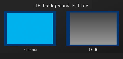
To replace some CSS3 rules, you can also use IE filters. Here's an example for a background gradient:
background: #FFFFFF ;
filter: progid:DXImageTransform.Microsoft.gradient(startColorStr= "#444444" , EndColorStr= "#999999"); /* IE6–IE9 */
The following property is equivalent to the "transform" rule. But its syntax is so complicated that I recommend using a special generator to calculate the required value.
/* IE8+ - must be on one line, unfortunately */
Ms-filter: "progid:DXImageTransform.Microsoft.Matrix(M11=0.9848077530122079, M12=-0.17364817766693127, M21=0.17364817766693127, M22=0.9848077530122079, SizingMe thod="auto expand")" ;
filter: progid:DXImageTransform.Microsoft.Matrix(
M11 = 0.9848077530122079,
M 12 = -0.17364817766693127,
M21 = 0.17364817766693127,
M22 = 0.9848077530122079,
SizingMethod= "auto expand");
margin-left: -14px ;
margin-top: -21px ;

IN END
As you can see, we can use CSS3 properties and selectors without fear of browsers like Internet Explorer. I hope this article was useful to you and you will find practical application of the knowledge you have acquired. In the next article I will tell you how to integrate CSS3PIE into Joomla, since many webmasters have a big problem with this.
Cross-browser compatibility is the ability of a site to display correctly in different browsers. The resource should work the same in all browser versions.
This is especially important in the era of responsive web design, when the ability of the front-end to adapt to a wide range of various devices while still providing optimal viewing experience.
Previously, a designer would create a design layout in Photoshop, which would then be transferred to HTML and CSS. Today, technological changes are forcing us to rethink this concept. We can no longer predict which browser, resolution or device will be used to view the site. Gone are the days when most computers used a fixed resolution of 1024 by 768 pixels, and sites could be designed with static dimensions.
Modern browsers fully support HTML5 and CSS3. But the same HTML/CSS/JavaScript code is interpreted differently in older browsers, leading to “cross-browser incompatibility” of the site. This is especially true for old Internet versions Explorer.
In this article we will look at current statistics on web page views and provide a list of tools that help solve various problems compatibility.
1. Current situationGlobal statistics for 2015 show that the top 14 used screen resolutions range from 1920 by 1080 to 320 by 480 pixels.
Although Windows 7 (31.20%) still holds a large market share, mobile platforms are beginning to replace traditional desktop platforms.
Looking at the statistics for 2015 on the browsers used, we see that the first place belongs to Chrome (all versions - 44.87%), second place - Firefox (all versions - 10.37%), third Internet Explorer 11 (6.84 %).
Accelerated rate of release of new Google versions Chrome and Firefox allow you to more efficiently develop projects for these platforms. A slightly different picture emerges for the “bad guy” Internet Explorer, because old versions of it can still be found on the Internet. And this leads to problems with cross-browser compatibility of the site.
Microsoft stopped supporting IE6 on April 8, 2014. And from 2016, only the latest version of Internet Explorer will be supported and updated. This effectively means that support for IE7 and IE8 was completely dropped at the beginning of 2016, regardless of operating system. IE9 will only be supported in Windows Vista, IE10 - only on Windows Server 2012, IE11 - on Windows 7 and Windows 8.1:

As a result, we need to stop developing for IE6 and, as well as IE7. To justify this strategy, here are a few examples of decisions made by well-known companies: Google stopped supporting IE8 in November 2012, and IE9 in October 2013.
Github no longer supports IE 7 and 8. In addition, some of the Twitter functionality does not work in IE8. And finally, the popular framework will not support IE8, starting with version 4.
However, usage statistics may vary by region, with 6.11% of users in China still browsing through IE8 in 2015. If we consider that there were approximately 724,400,000 Internet users in China, it can be understood that approximately 44,200,000 Chinese people continue to use IE8 this year.
Therefore, regional markets, specific customers and industry requirements may vary significantly. This is especially true for corporate and government agencies.
2. Analyze your audienceThe basic principle here is this: the higher the required cross-browser compatibility, the more development time will be required, which leads to an increase in the cost of the project. To make an informed, economically sound decision, you need to ask yourself the following questions:
- What is your target audience?
- Which geographic region should you target?
- What browsers and devices do your visitors use?
- Are there technical factors in your company or industry that force you to support specific versions of older browsers?
- What are the terms ecommerce conversion and profitability rates various groups users by browser version?
By answering these questions using statistical data, e.g. Google Analytics, you can get an objective picture.
3. Problems with legacy browsers and different development approachesResponsive web design relies heavily on media queries to modify CSS for different screen resolutions. In addition, modern websites are characterized by the use of HTML5 semantic elements (for example, , , , , ) to group design components. CSS3 selectors are used to select specific elements and then assign styles (for example, , :checked , :nth-child(n) , :not(selector) , :last-child) ). Finally, responsive typography is often specified using REM (root em) units.
This brings us to the following technical challenges when implementing CSS cross-browser compatibility:
- CSS3 media queries
- Semantic HTML elements 5: not supported in IE6, 7 and 8;
- CSS3 Selectors: Not supported in IE6. Only partially supported in IE7 and 8;
- REM units: not supported in IE6, 7 and 8. Only partially supported in IE9 and 10;
- CSS rules limit: IE9 and below only support 4095 CSS selectors. The rules after the 4095th selector do not apply.
The above mistakes will have the greatest impact on the strategy used when implementing responsive design.
There are two main development strategies: incremental simplification and progressive enhancement.
Progressive improvement - based on the principle of starting development from a common denominator, from the minimum technical requirements and the level of user experience offered by the site. Visitors accessing the site via latest versions browsers and devices, will be served by a progressively expanded version of the site with all the latest features.
On the other hand, users of older browsers and slow Internet connections will be offered a graphically stripped-down but still functional version of the site.
This approach to implementing cross-browser compatibility involves starting development with a simple version, to which more complex elements are then added. Older browsers will be able to display the site with basic level interaction experience. And new HTML/CSS/JavaScript features will be available in browsers that can actually use them.
In contrast, incremental simplification provides a fully functional level of UX in modern browsers. And then gradually reduces its complexity for older browsers due to graphics, but without touching on functionality. The idea is to start developing with the latest web standards and then try to minimize the problems associated with older browsers.
Which approach you choose depends on personal preferences and project conditions:
- Progressive enhancement provides greater stability as you can gradually add new features to your modern browsers. But it requires more careful planning;
- Some developers argue that there is no point in supporting legacy browsers and should be used Newest technologies. Support for modern browsers gives much more best experience interactions;
- There is a perception that progressive enhancement is dead because many JavaScript applications don't work well with this approach;
- Web accessibility for public institutions may be subject to local legal requirements and may require a specific approach.
With the advent of feature detection tools like Modernizr, I'm personally leaning towards using incremental simplification and browser blacklisting when developing compliant sites.
4. Testing, testing, testing...To detect potential JavaScript cross-browser issues as quickly as possible, you should test your site in different browsers and resolutions during development. There are various software emulators that can help us:
- Browserstack is a commercial service that provides access to a test environment where you can test your project on more than 700 desktop browsers and mobile devices using a virtual machine in the cloud;
- Microsoft Virtual Machines - If you're running Linux, you won't have access to Internet Explorer. The solution may be to download the images virtual machines for IE6 to IE11, which can then be used in conjunction with Oracle VM Virtualbox or Vagrant for local testing;
- Different screen resolutions for a specific browser can be quickly tested using the online service Screenfly. Using browser plugins such as Window Resizer for Google Chrome, or directly in the developer tools section of Chrome and Firefox.
I usually start new projects by resetting the CSS using Normalize.css, which provides better cross-browser compatibility when defining default HTML element styles up to Internet Explorer 8. Normalize.css saves the necessary element styles and normalizes them appearance and fixes a number of bugs and inconsistencies across various browsers.
In addition, many legacy browsers cannot interpret unknown HTML elements and CSS properties. When the browser encounters a piece of HTML or CSS that it doesn't understand, it ignores it and continues the rendering process. Many applications use vendor prefixes to add new, experimental, or non-standard CSS features before implementing them in the specification:
// Webkit browsers such as Chrome and Safari -webkit- // Firefox -moz- // Internet Explorer -ms- // Opera -o-
The problem is that prefixes are awkward to use and have many bugs associated with them. So I use the CSS Autoprefixer plugin in combination with Grunt.
Regular CSS rules will be processed using the plugin and prefixes will be added to them based on the “Can I Use” database. It is recommended to specify in the configuration the versions of browsers that need to be supported, for example:
options: ( browsers: ["last 2 versions", "ie >= 8", "Firefox >= 12", "iOS >= 7", "Android >= 4"] )
As an example, consider the following CSS class:
Example ( background-image: linear-gradient(top left, #4676dd, #00345b); display: flex; transition: 1s all; )
Using CSS Autoprefixer it converts to:
Example ( background-image: -webkit-linear-gradient(top left, #4676dd, #00345b); background-image: -moz-linear-gradient(top left, #4676dd, #00345b); background-image: linear- gradient(top left, #4676dd, #00345b); display: -webkit-box; display: -webkit-flex; display: -moz-box; display: -ms-flexbox; display: flex; -webkit-transition: 1s all; -moz-transition: 1s all; transition: 1s all; )
6. Conditional commentsIf you need to create fallback CSS or enable cross-browser JavaScript for earlier versions of Internet Explorer, you can use conditional comments. They are supported in Internet Explorer 5-9, they use the syntax HTML comments in combination with boolean values. Depending on the boolean value (true or false), the code inside the comment tags will be shown or hidden in the corresponding browser versions:
CODE THAT WILL BE EXECUTED // if Internet Explorer // if NOT Internet Explorer // if Internet Explorer 7 // if NOT Internet Explorer 7 // if Internet Explorer 9 or LOWER // if Internet Explorer 7 or HIGHER // if Internet Explorer 6 OR 7 // if HIGHER Internet Explorer 6 BUT BELOW 9
The code is automatically hidden in all browsers that do not support conditional comments. A clear example of how conditional comments can be used effectively in practice is the HTML5 Boilerplate, which adds specific CSS classes for outdated versions Internet Explorer:
7. Polyfills
Technical inconsistencies of legacy browsers for responsive web design can be corrected using a polyfill. It is a piece of JavaScript code that "fills" a specific functional gap between a legacy browser and a function. There are a number of polyfills that can be used to provide browser support for HTML5 features.
Below are several polyfills designed to eliminate the site's cross-browser issues mentioned in point 3:
- respond.js - implements CSS3 media queries for Internet Explorer 6 - 8;
- html5shiv allows the use of HTML5 semantic elements in Internet Explorer 6 - 8;
- selectivzr - Emulates CSS3 selectors and pseudo-classes in Internet Explorer 6 - 8. Full support requires either Mootools 1.3 or NWMatcher 1.2.3. Partial support is available with JQuery 1.3/1.4;
- REM-unit-polyfill - Determines whether the browser supports rem units and provides a fallback. Works with IE8 and below.
To use the specified polyfills, they must be added from the CDN or as a file in the correct format inside the conditional comments in the section (don't forget to include one of the JavaScript libraries required for Selectivizr):
For each project, you need to evaluate whether these additional scripts are really necessary, as they can lead to performance problems. Most polyfills are compact, but each additionally loaded script is additional HTTP request. This may slow down page loading.
8. Defining Functions with ModernizrThe Modernizr library, written in JavaScript, will help you check the cross-browser compatibility of a site: whether a specific HTML5 or CSS3 function is supported in different browsers. If the feature is not available, alternative CSS or JavaScript code may be loaded.
The idea is to directly determine the functionality of the browser, rather than trying to install a specific version of it. And based on this, derive its functionality, which is a less effective and reliable way.
It's worth noting that Modernizr does not add missing features to the browser. Therefore, you will need to provide code from fallback CSS or polyfill.
First you need to download the fully functional assembly. Later, when you're ready to develop, you can create a custom build with the specific features you're testing. All you have to do is add the .no-js class to your site's HTML tag and include the Modernizr script in the head section after any CSS file:
Modernizr Demo Modernizr Demo
This is a Modernizr exercise.
The .no-js class is used to check if JavaScript is enabled in the user's browser. If enabled, Modernizr will replace .no-js with the .js class. Modernizr's testing feature analyzes whether a particular feature is supported in the browser and generates a series of classes that are added to the HTML element. Google Chrome 47.0.2526.111, for example, will return the following object classes.
Currently, Modernizr is available as a global object that can be called in conjunction with a function name to check whether it exists. It returns a boolean value (true or false).
Let's look at two simple examples of CSS and JavaScript.
Example solution CSS problems cross-browser compatibility: checking SVG support and providing as backup option PNG
Currently, there is a tendency towards more and more active use SVG (Scalable Vector Graphics), but these graphics are not supported in IE8 and below. If SVG is supported in the browser, Modernizr generates the CSS class .svg . If SVG is not available, the tool adds the .no-svg class to the HTML. With the CSS below, browsers that support SVG will use the regular .logo class, while browsers that don't support SVG will use the .no-svg rules:
Logo ( background-image: url("logo.svg"); width: 164px; height: 49px; ) .no-svg .logo ( background-image: url("/logo.png"); width: 164px; height : 49px; )
JavaScript Example: Defining border-radius and adding appropriate CSS classes
Rounding frame corners is not supported in IE8 and below. We can create different CSS classes that are applied depending on the presence of the border-radius function:
// Class for a browser with the border-radius function .round-borders ( border-radius: 5px; ) // Class for a browser without the border-radius function .black-borders ( border: 3px solid #000000; )
Now you can use JavaScript to store the target ID as a variable and then add CSS classes via a condition:
var element = document.getElementById("TestID"); if (Modernizr.borderradius) ( element.className = "round-borders"; ) else ( element.className = "black-borders"; )
ConclusionWhen it comes to responsive web design in legacy browsers, there is no universal solution. It is important to analyze the audience of the resource to get an idea of the real number of browser users. Next, you need to thoroughly test the site to identify potential cross-browser issues.
By carefully choosing the right polyfills to add in conditional comments, you can get around the lack of the most essential HTML5 features. In addition, the ability to determine using Modernizr is in a convenient way provide fallback CSS and JavaScript for legacy browsers that lack support for modern HTML5 functionality Pop-up message when clicking on a link with using JavaScript
While working on one of the tasks, I came across the need to display a pop-up window before redirecting the user to a specific link. We…