How to enable looping animation in css. Introduction to CSS Transformations
We recently saw that transitions- it's just a way animations style properties from original before final condition.
So transitions in CSS are specific type of animation, where:
- there are only two states: beginning and end;
- the animation is not looped;
- intermediate states are controlled only by a time function.
But what if you want:
- have control over intermediate states?
- loop animation?
- do different types animations for one element?
- animate a specific property only on half ways?
- imitate various functions time for different properties?
Animation in CSS allows you to do all this and more.
Animation is like a mini-film, where you, as a director, give instructions (style rules) to your actors ( HTML elements) For different scenes(key frames).
Animation Properties
Like transition , the animation property is abbreviated for a few others:
- animation-name : animation name;
- animation-duration : how long the animation lasts;
- animation-timing-function : how intermediate states are calculated;
- animation-delay : animation starts after some time;
- animation-iteration-count : how many times the animation should be executed;
- animation-direction : should the movement go in reverse side or not;
- animation-fill-mode : what styles are applied before the animation starts and after it ends.
Quick example
To animate the download button, you can write an animation bouncing:
@keyframes bouncing( 0% ( bottom: 0; box-shadow: 0 0 5px rgba(0,0,0,0.5); ) 100% ( bottom: 50px; box-shadow: 0 50px 50px rgba(0,0, 0,0.1); ) .loading-button ( animation: bouncing 0.5s cubic-bezier(0.1,0.25,0.1,1) 0s infinite alternate both; )
First you need to write an actual bouncing animation using @keyframes and call it .
I used abbreviated animation property and included all possible options:
- animation-name: bouncing (same as keyframe name)
- animation-duration: 0.5s (half a second)
- animation-timing-function: cubic-bezier(0.1,0.25,0.1,1)
- animation-delay: 0s (no delay)
- animation-iteration-count: infinite (plays endlessly)
- animation-direction: alternate (goes back and forth)
- animation-fill-mode: both
@keyframes
Before applying animation to HTML elements, you need write an animation using keyframes. In general, key frames are each intermediate step in animation. They are determined using percentages:
- 0% - first step of animation;
- 50% is the halfway step in the animation;
- 100% is the last step.
Can also be used keywords from and to instead of 0% and 100%, respectively.
You can define as many keyframes as you want, like 33%, 4% or even 29.86%. In practice, you will only write some of them.
Every key frame is CSS rule , this means you can write CSS properties as usual.
To define an animation, simply write the keyword @keyframes with it name:
@keyframes around ( 0% ( left: 0; top: 0; ) 25% ( left: 240px; top: 0; ) 50% ( left: 240px; top: 140px; ) 75% ( left: 0; top: 140px ; ) 100% ( left: 0; top: 0; ) ) p ( animation: around 4s linear infinite; )
Note that the start 0% and end 100% contain same rules CSS. This ensures that the animation loops perfectly. Since the iteration counter is set to infinite , the animation will go from 0% to 100% and then immediately back to 0% and so on indefinitely.
animation-name
Name animation is used by at least, twice:
- at writing animations using @keframes ;
- at use animation using the animation-name property (or the animation shorthand property).
Like names CSS classes, the animation name can only include:
- letters (a-z);
- numbers (0-9);
- underscore(_);
- hyphen (-).
The name cannot begin with a number or two hyphens.
animation-duration
Like transition duration, animation duration can be set to seconds(1s) or milliseconds(200ms).
Selector ( animation-duration: 0.5s; )
The default value is 0s, which means no animation at all.
animation-timing-function
Similar to transition timing functions, animation timing functions can use keywords, such as linear , ease-out or can be defined using arbitrary ones Bezier curves.
Selector ( animation-timing-function: ease-in-out; )
Default value: ease.
Since animation in CSS uses keyframes, you can set linear function of time and simulate specific Bezier curve by defining many very specific key frames. Check out Bounce.js for advanced animation.
animation-delay
As with transition delay, animation delay can be set to seconds(1s) or milliseconds(200ms).
The default is 0s, which means no delay of any kind.
Useful when including multiple animations in series.
A, .b, .c ( animation: bouncing 1s; ) .b ( animation-delay: 0.25s; ) .c ( animation-delay: 0.5s; )
animation-iteration-count
By default, the animation only plays once(value 1). You can set three types of values:
- whole numbers, like 2 or 3;
- fractional numbers like 0.5, which will only play half the animation;
- the infinite keyword, which will repeat the animation endlessly.
animation-direction
The animation-direction property specifies whether in what order key frames are read.
- normal : starts at 0%, ends at 100%, starts at 0% again.
- reverse : starts at 100%, ends at 0%, starts at 100% again.
- alternate : starts at 0%, goes to 100%, returns to 0%.
- alternate-reverse : starts at 100%, goes to 0%, returns to 100%.
This is easier to imagine if the animation iteration count is set to infinite .
animation-fill-mode
The animation-fill-mode property determines what happens before start of animation and after its completion.
When determining key frames can be specified CSS rules , which will be applied at different animation steps. Now these CSS rules can collide with those who already applied to animated elements.
animation-fill-mode lets you tell the browser if animation styles Also should be applied beyond animation.
Let's imagine button, which is:
- red default;
- becomes blue at the beginning of the animation;
- and in the end green when the animation is complete.
Before the advent of CSS3, the word “animation” made layout designers break into a cold sweat. And all because in those days it was impossible to make high-quality and beautiful animation trivial task. CSS couldn't do this, so all animations were done in JavaScript. It was necessary to sift through a bunch of forums, find the same comrades in misfortune, spend a lot of time on development, and in the end hear from the designer: “Okay, this will do.” And when CSS3 finally came out, the fireworks didn't stop until the morning, and the champagne flowed like a river. It was a great day for all web developers (the next such day was when Microsoft announced the end of support Internet Explorer). With the advent of CSS3, many previously complex tasks have become simple and enjoyable to work with. The same applies to animations in CSS, which I will talk about in this article.
CSS transitions
CSS transitions allow you to make changes to CSS properties smoothly and over time. This way, you get the opportunity to control the process of an element's transition from one state to another. Let's start with the simplest example and move on.
When you hover the cursor over the square, the background color changes smoothly.
Now let's take a closer look at how to manage transitions in CSS. We have only 5 properties that allow us to control transition animation:
- transition-property;
- transition-duration;
- transition-timing-function;
- transition-delay;
- transition;
transition-property- specifies a list of properties that will be animated; properties not specified here will be modified as usual. You can animate all properties for a specific element by specifying the value all. If you do not specify any properties, the default value is all.
Transition-property: width;
transition-duration- sets the duration of the animation; the time can be specified in seconds or milliseconds.
Transition-duration: 1s;
transition-timing-function- time function, indicates points of acceleration and deceleration for certain period time to control changes in animation speed. Simply put, you can use this property to specify the behavior for an animation. For example, we can speed up the animation at the beginning and slow it down at the end, or vice versa. Bezier curves are used to define the animation process. In general, the transition-timing-function allows you to create a lot of different behaviors for animations, this is a whole topic for an article, so we won’t go deeper here.
Transition-timing-function: cubic-bezier(0, 0, 1, 1);
transition-delay- sets the time delay before the start of the animation, can be specified in seconds or milliseconds.
Transition-delay: 500ms;
transition is a general property that allows you to list the first four properties in the order: property, duration, timing-function, delay.
Transition: background-color 1s cubic-bezier(0, 0, 1, 1) 500ms;
We got this simple animation: when you hover the mouse over the square, the width changes; animation duration is one second; animation plays on linear function; delay before animation starts 500 milliseconds.
WITH using CSS transitions can animate almost all properties and create many interesting, beautiful, functional and even complex animations that will complement and enhance your project. For example, I made this Material-FAB on pure CSS using transitions:
CSS animations
CSS animations allow you to create more complex animations than CSS transitions. The whole secret is in @keyframes. The @keyframes rule allows you to create animation using a set of key frames, that is, it describes the state of an object at a certain point in time. Let's look at a simple example.
Our circle has come to life and it seems to be pulsating.
There are 9 properties that allow you to control CSS animations:
- animation-name;
- animation-duration;
- animation-timing-function;
- animation-delay;
- animation-iteration-count;
- animation-direction;
- animation-play-state;
- animation-fill-mode;
- animation;
animation-name- here is the name of the animation that associates the @keyframes rule with the selector.
Animation-name: my-animation; @keyframes my-animation ( 0% ( opacity: 0; ) 100% ( opacity: 1; ) )
animation-iteration-count- sets the number of repetitions of the animation, the default value is 1. The value infinite means that the animation will play endlessly.
Animation-iteration-count: 2;
animation-direction- sets the direction of the animation.
Animation-direction: reverse;
animation-play-state - this property controls stopping and playing of animation. There are two values, running (the animation plays, by default) and paused (stops the animation).
Animation-play-state: paused;
animation-fill-mode- sets which CSS properties will be applied to the object before or after the animation. Can take the following values:
- none - animated CSS properties will be applied to the object only while the animation is playing, and upon completion the object will return to its original state;
- forwards - animated CSS properties will be applied to the object after the animation has finished playing;
- backwards - animated CSS properties will be applied to the object before the animation starts playing;
- both - animated CSS properties will be applied to the object both before and after the animation ends;
Animation-fill-mode: backwards;
Properties animation-duration, animation-timing-function, animation-delay They work the same way as similar properties in CSS transitions, which I wrote about earlier, so I won’t repeat them.
With animations CSS you can create quite complex animations without using JavaScript. A striking example is loaders, that is, elements that show that something is loading on your page. Here are some examples:
Motion Path Module
Motion Path Module CSS allows you to create movement of objects along a path through the special motion-path property. Previously, such animation could only be done with using SVG or complex scripts.
This specification has 3 properties:
- motion-path;
- motion-offset;
- motion-rotation;
motion-path- this property allows you to specify the points (coordinates) along which the object will move. The syntax is the same as the SVG path attribute.
Motion-path: path("M 235.323 Q 412.440 365.615 Q 400.300 670.240 L 870.340 L 975.535 Q 730.600 630.535 z");
motion-offset- this property sets an object in motion from the starting point to the ending point. It accepts either double the length or a percentage. In order for the object to start moving, you need to define an animation that will go from 0 to 100%.
@keyframes airplane-fly ( 0% ( motion-offset: 0; ) 100% ( motion-offset: 100%; ) )
motion-rotation- this property allows you to specify which side forward the object will move. You can specify auto, reverse, or your own value in degrees ("-45deg", "30deg", etc.).
Motion-rotation: auto;
Unfortunately, motion-path is currently only supported in Chrome and Opera, but let's hope that other browsers will soon follow their example, because the thing is really useful.
For those who have not yet understood how this works, or want to understand it better, I made an example (link to codeopen).
Much of what brings us joy in animation comes from moving around the screen various objects. hover CSS effects attract users' attention to the content, a certain part of the interface, and improve the overall perception of the resource.
Moving around can be a little crazy, like this:
The movement may not be so obvious. For example, the one that appears when you hover your mouse over one of the squares in the figure below:
Your browser does not support inline frames or is currently configured not to display inline frames.
In the examples given, movement is implemented using CSS. Both animation and CSS transitions make it extremely easy to go from static to moving. But despite this simplicity, there are certain nuances that need to be taken into account in order to CSS hover The hover effect worked smoothly. In this article I will tell you exactly about them.
Transformation with translate3d()
When you move an element, its vertical and horizontal positions change. There are several CSS properties, which are used for this. But I want to recommend you to use the translate3d function of the transform property instead of the usual margin , padding , left , top because it provides smoother animation.
The translate3d function takes three arguments, but first let's look at the ones responsible for moving content horizontally and vertically:
The X argument specifies horizontal movement, Y – vertical movement. For example, if you want to move content 20 pixels to the right and up, the translate3d function should look like this:
Foo ( transform: translate3d(20px, 20px, 0px); )
We will not consider the third argument, which determines the movement along the Z axis. Since we are interested in 2d-hover CSS effects.
As you can see, the translate3d function is not particularly complicated. Next we'll look at how to use it in CSS animation to create movement.
Transition
To use this property in a transition, you need to complete two steps. First you need to specify transform as the property that should track the transition:
PictureContainer img ( position: relative; top: 0px; transition: transform .2s ease-in-out; )
Once you've defined a transition, you can set the transform property with the translate3d function:
PictureContainer img:hover ( transform: translate3d(0px, -150px, 0px); )
As shown in the example at the beginning of the article, the CSS hover effect when hovering the mouse cursor over any of the elements causes the image to shift upward by 150 pixels.
Animation
In case of animation, make sure that the keyframes in @keyframes contain a transform property with translate3d :
@keyframes bobble ( 0% ( transform: translate3d(50px, 40px, 0px); animation-timing-function: ease-in; ) 50% ( transform: translate3d(50px, 50px, 0px); animation-timing-function: ease -out; ) 100% ( transform: translate3d(50px, 40px, 0px); ) )
The example from the article contains everything you need to see how the CSS hover effect for table layout works.
Don't forget about prefixes
For the markup to work in different browsers, be sure to use vendor prefixes or the --prefix-free library for the transform property.
Transitions with JavaScript
You can also create moving animations in JavaScript. The same rules apply here. First you need to set the position using transform translate3d , but in JavaScript this is a little more complicated.
The code snippet needed for this looks like this:
function getSupportedPropertyName(properties) ( for (var i = 0; i< properties.length; i++) { if (typeof document.body.style] != "undefined") { return properties[i]; } } return null; } var transform = ["transform", "msTransform", "webkitTransform", "mozTransform", "oTransform"]; var item = document.querySelector("#theItem"); var transformProperty = getSupportedPropertyName(transform); if (transformProperty) { item.style = translate3d(someValueX, someValueY, 0px); }
This code seems complicated because we are using prefixes and checking to match the version of the transform function being used.
Why doesn't it work for us to set position using margin , top , left , etc.?
Unless you have a specific reason to do so, don't use CSS to create hover effects. margin properties, padding , top , left , bottom or right . Although this may seem counterintuitive. Let me clarify...
Unnecessary calculations
When you change the set of values for the six CSS properties I just listed, the browser makes additional calculations about how that will appear in the layout of the entire page. I'm not against using these properties for layout work. But using them in animations or transitions and changing values sixty times per second is too much.
You can set the position of the element you're moving to either fixed or absolute . This will save the browser from having to calculate the layout for the entire document. But in this case, the browser still performs calculations on the element that moves. And the result of using translate3d will not necessarily be identical to the result obtained using margin, padding, etc. Moreover, as you will see in the next section, they will not be 100% identical.
Hardware acceleration
When we are dealing with displaying elements on the screen, the associated calculations can be done using a processor or video card. But for CSS creation hover effects for table layout it is better to use a video card:

The GPU is only designed to handle display-related tasks. At the same time, the processor processes in parallel great amount various tasks. And in order for your animation to display smoothly, you cannot neglect this pattern. The difference in the smoothness of the animation display may not be very noticeable on a powerful desktop computer or laptop, but will clearly appear on mobile devices. From personal experience I can say that on these devices, animations using the CPU are played more choppy than those that use the GPU.
How to ensure that the animation is in hardware acceleration did you use GPU? Apply translate3d ! When you transform an element using translate3d, it is processed through the GPU in Webkit browsers such as Chrome and Safari ( which are installed on iPhone and iPad), in Internet Explorer 9/10, as well as in the latest Firefox versions. This gives translate3d clear advantages.
What about JavaScript?
As for CSS hover effects created in JavaScript, where all the interpolation is handled by code, I don't actually know if GPU usage so productive. But to install with using JavaScript CSS transitions and animations with the translate3d property are used by the GPU.
When you use JavaScript to set animation or transition properties, the interpolation between the start and end points of the animation is still created by the browser. The moving blue circles that you may have seen at the beginning of this article are proof of this.
God bless the transformation!
The reason transform is more performant is because it doesn't affect any other elements. Any actions you perform apply to just one element, and the browser doesn't have to rebuild the entire window. It only modifies the part of the screen that contains the moving content. This does not depend on whether the GPU is involved or not.
Creating complex animations can sometimes become a time-consuming process, and this is where animation libraries and generators come in handy. This article provides a list the best tools to create CSS3 animations.
1. Magic CS33 Animations
Magic CSS3 Animations is a package of CSS3 animations with special effects that you can freely use for any web projects. Just include the magic.css CSS style or a minified version of magic.min.css .
2. CSS3 Animation Cheat Sheet

CSS3 Animation Cheat Sheet is a set of pre-installed plug-and-play animations for web projects. To use it, you need to add styles to the site and apply the prepared ones CSS classes to the elements you want to animate. CSS3 Animation Cheat Sheet uses @keyframes rule and works in all latest versions browsers (including IE 10).
3. CSS3 Keyframes

CSS3 Keyframes Animation Generator is an online tool that allows you to create animations using the @keyframes rule.
4. Magic

Includes many CSS effects. The effects are sorted into several categories ( magic, perspective, rotation, flickering, static, slides, CSS3 hover animation), and they are all quite beautiful. Each of them has its own classes. The easiest way to apply them is to add these classes to the target elements via JavaScript.
5. Animate.css

Animate.css provides a set of cross-browser CSS3 animation effects. Effects can be used to attract attention, creating animations based on the appearance and disappearance of elements.
6. Bounce. Js

This JavaScript library to create dynamic animation. Just add a component and select a preset. After this you can get a short URL or export the CSS3 animation from the examples.
7. Hover.CSS
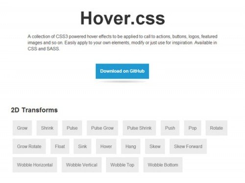
Hover.CSS is a useful collection of CSS3 effects that can be used for calls to action, buttons, logos, custom images, and more. To use the collection, simply copy and paste the effect code into the CSS or place a link to its style file.
8. Ani.js

AniJS is a declarative CSS animation library that makes your development faster and richer. It is fully documented and easy to use.
9. Progress.js

ProgressJs is a JavaScript and CSS3 library that helps developers create and manage progress bars. You can create own template for a progress bar or easily customize a ready-made one.
10. Keyframer

Keyframer is handy tool which will help you create CSS3 animations. Keyframer is quite easy to use. To add a keyframe, you only need to click on the timeline and then click on the round button to apply CSS styles for the animation. Or the cross button to delete the current frame.
11. Stylie

Tool for easy creation CSS3 animations. You need to set up the animation using the graph, change it, get the generated CSS code and you're done!
12.CSSketch

CSSketch is a Sketch 3 plugin that allows you to quickly change your design by inserting stylesheets. It supports style language ( less). This allows you to use functions and variables in your stylesheet. CSSketch is software with fully open source code, so you can contribute to its development.
13. ALighter

JQuery plugin for creating animated lighting and CSS3 background animation. You can customize the animation ( speed and size), Effect ( color, transparency and blur) and set a specific duration or disable the timer completely.
14. deCSS3

This is a tool for testing fault tolerance ( gradual degradation) CSS3 code. With it, you can see how the web page will be displayed in IE 6-8 versions.
15.GFX

GFX is a 3D CSS3 animation library that extends JQuery with several useful features For software creation CSS3 transitions, which are controlled using the setTimeout method.
Translation of the article " 15 Best CSS3 Animation Tools for Developers » was prepared by the friendly project team
This is an experimental technology
Since the specification of this technology has not yet stabilized, please see for usage in different browsers. Also note that the syntax and behavior of the experimental technology may change in future browser versions following specification changes.
CSS animations allow you to animate transitions from one configuration CSS styles to others. CSS animations consist of two components: a style description of the animation and a set of keys that define the start, end, and possibly intermediate states of the animated styles.
There are three advantages of CSS animation over traditional methods:
- Easy to use for simple animations; You can create animation without knowing JavaScript.
- Animations will work well even under moderate system loads. Simple animations In JavaScript, if they are poorly written, they often perform poorly. The engine can use frame-skipping and other techniques to keep performance at such a high level.
- Allows the browser to control the animation sequence, thereby optimizing the browser's performance and efficiency. For example, reducing the refresh rate of animation frames in non-viewable areas this moment tabs.
Configuring Animation
p ( animation-duration: 3s; animation-name: slidein; ) @keyframes slidein ( from ( margin-left: 100%; width: 300%; ) to ( margin-left: 0%; width: 100%; ) )In the style for an element, it defines a paragraph of text.">
The animation-duration property specifies that the animation should take 3 seconds to complete from start to finish, and that the name for the @keyframes describing the animation itself is defined as "slidein".
The element defines a paragraph of text.">
You can add other custom styles to decorate it, but we only wanted to demonstrate the animation effect here.
Keys are defined using the @keyframes rule. IN in this case we only have two keys. The first one at 0% animation (from). Here we give the element a left padding of 100% and a width of 300% (three times the width of the parent element). This causes the title to define a paragraph of text during the first frame of the animation.">
is located outside the right edge of the browser window.
The second key (to) determines the end of the animation, i.e. (100%). The left padding is set to 0 and the width to 100%. It looks like the title defines a paragraph of text.">
floats to the left edge of the browser window.
Adding other keywords
Let's add other keys to the previous example. Let's say we want the title font size to temporarily increase as we move to the left, and then return to its original value. This is easy to implement using the following key:
75% ( font-size: 300%; margin-left: 25%; width: 150%; ) p ( animation-duration: 3s; animation-name: slidein; ) @keyframes slidein ( from ( margin-left: 100% ; width: 300%; ) to ( margin-left: 0%; width: 100%; ) 75% ( font-size: 300%; margin-left: 25%; width: 150%; ) )
The Caterpillar and Alice looked at each other for some time in silence: at last the Caterpillar took the hookah out of its mouth, and addressed her in a languid, sleepy voice.
This tells the browser that when the animation is 75% done, the font should be 300% and the width 150%.
(Refresh the page to see the animation, or click the CodePen button to play it in the CodePen window)
Repeat setting
To set up repetition, you need to add the animation-iteration-count property and give it a value equal to the number of times the animations need to be repeated. In this case, let's set the value to infinite to repeat infinitely:
P ( animation-duration: 3s; animation-name: slidein; animation-iteration-count: infinite; ) @keyframes slidein ( from ( margin-left: 100%; width: 300%; ) to ( margin-left: 0% ; width: 100%; ) )
The Caterpillar and Alice looked at each other for some time in silence: at last the Caterpillar took the hookah out of its mouth, and addressed her in a languid, sleepy voice.
Move text left and right
So we've got the repeating set up, but there's something strange. With each repetition, the text again “jumps” off the edge of the browser window. What we want is for the text to move left and right. This can be easily achieved by setting the property to alternate:
P ( animation-duration: 3s; animation-name: slidein; animation-iteration-count: infinite; animation-direction: alternate; ) @keyframes slidein ( from ( margin-left: 100%; width: 300%; ) to ( margin-left: 0%; width: 100%; ) )
The Caterpillar and Alice looked at each other for some time in silence: at last the Caterpillar took the hookah out of its mouth, and addressed her in a languid, sleepy voice.
Using Shortcodes
The animation shortcode is useful for saving space in your code. For example, the rule we use in this article is:
P ( animation-duration: 3s; animation-name: slidein; animation-iteration-count: infinite; animation-direction:alternate; )
can be replaced with:
P ( animation: 3s infinite alternate slidein; )
Setting multiple values for animation properties
The CSS animation property can have multiple values, separated by commas, this is used to specify multiple animation values in one rule and set different durations, number of repetitions, etc. for different animations. Let's look at a few examples to see the difference:
In the first example, the animation name property is set to three values, and the duration and number of repetitions properties are set to one each. In this case, all three animations have the same duration and number of repetitions:
Animation-name: fadeInOut, moveLeft300px, bounce; animation-duration: 3s; animation-iteration-count: 1;
The second example sets three values for each of the properties. In this case, each animation is executed with the corresponding values in each property, so for example fadeInOut has a duration of 2.5s and a repetition count of 2, etc.
Animation-name: fadeInOut, moveLeft300px, bounce; animation-duration: 2.5s, 5s, 1s; animation-iteration-count: 2, 1, 5;
The third example defines three values for the animation name, but two values for the duration and number of repetitions. In the case where the number of values is not enough for each animation, the values are taken cyclically from start to finish. For example, fadeInOut will have a duration of 2.5s, and moveLeft300px will have a duration of 5s. The duration values have run out, now they are taken from the beginning - bounce will get a duration of 2.5s. The value for the number of repetitions (as well as other specified properties) will be determined in the same way.
Animation-name: fadeInOut, moveLeft300px, bounce; animation-duration: 2.5s, 5s; animation-iteration-count: 2, 1;
Using Animation Events
You can gain additional control over the animation as well useful information about her, with the help animation events. These events, represented by an AnimationEvent object, can be used to determine when an animation begins and ends, or when a new iteration begins. Each event contains the point in time at which it occurred, as well as the name of the animation that caused the event.
We will modify the text to display some information about each animation event. This way we can see how it works.
Adding CSS
Let's start with adding CSS. The animation will last 3s, will be called "slidein", will repeat 3 times, and also the value animation-direction installed alternate. The @keyframes keys have their width and left padding set to such that the element will slide across the screen.
Slidein ( -moz-animation-duration: 3s; -webkit-animation-duration: 3s; animation-duration: 3s; -moz-animation-name: slidein; -webkit-animation-name: slidein; animation-name: slidein; -moz-animation-iteration-count: 3; -webkit-animation-iteration-count: 3; animation-iteration-count: 3; -moz-animation-direction: alternate; -webkit-animation-direction: alternate; animation- direction: alternate; ) @-moz-keyframes slidein ( from ( margin-left:100%; width:300% ) to ( margin-left:0%; width:100%; ) ) @-webkit-keyframes slidein ( from ( margin-left:100%; width:300% ) to ( margin-left:0%; width:100%; ) ) @keyframes slidein ( from ( margin-left:100%; width:300% ) to ( margin -left:0%; width:100%; ) )
Adding an Animation Event Handler
We'll use JavaScript to track all three possible animation events. The following code configures the handler; we call it when the document is first loaded.
Var e = document.getElementById("watchme"); e.addEventListener("animationstart", listener, false); e.addEventListener("animationend", listener, false); e.addEventListener("animationiteration", listener, false); e.className = "slidein";
It's pretty standard code; You can get Additional information See the documentation for element.addEventListener() . The last thing this code does is set the "slidein" class to the element being animated; we do this to start the animation.
Why? Because in our case, the animationstart event occurs as soon as the animation starts, and this happens before our script is executed. This way we can control the start of the animation ourselves by inserting a "slidein" class for the element being animated.
Event registration
Events will be passed to the listener() function shown below.
Function listener(e) ( var l = document.createElement("li"); switch(e.type) ( case "animationstart": l.innerHTML = "Started: elapsed time is " + e.elapsedTime; break; case " animationend": l.innerHTML = "Ended: elapsed time is " + e.elapsedTime; break; case "animationiteration": l.innerHTML = "New loop started at time " + e.elapsedTime; break; ) document.getElementById(" output").appendChild(l); )
This code is also very simple. This code watches event.type to determine the event type and adds the element
- to log the event that occurred.
- Started: elapsed time is 0
- New loop started at time 3.01200008392334
- New loop started at time 6.00600004196167
- Ended: elapsed time is 9.234000205993652
The output when the animation ends will look something like this:
Please note that the time shown in the output and the time we specified in the styles will not be the same. Also note that the animationiteration event is not sent after the iteration ends; the animationend event is sent instead.
HTML
For the sake of completeness, we will provide HTML. The markup contains a tag ul where all the information is displayed:
Watch me move
This example shows how to use CSS animations to make p elements move across the page.
In addition, we output some text each time an animation event fires, so you can see them in action.