HTML Layouts. Creating a simple layout Ready-made html layouts
In this article we will talk about sites that developers create manually, i.e. type-up.
The article is intended for users familiar with HTML And CSS . It is also advisable to know at least the basics Adobe Photoshop
One of the stages of creating a real website is creating a PSD template. You can also come across such names as layout, design or source.
The template is ordered to the designer. The designer draws the layout in Adobe Photoshop and saves it in PSD format.
What is PSD format?
For a better understanding, you can give a simple life example. As a child, everyone glued appliques. We cut out a house from paper and glued it on. We cut out the Christmas tree and glued it on. And so on until the work is ready.
Now you can imagine a situation in which the figures were cut out, laid out on the sheet in the right places, but not yet glued. So, the PSD file format can be compared to an application on which the figures have not yet been glued, but they have been arranged in the desired order.
Thanks to this, each such “figure”, or rather each individual fragment of the template, can be saved as a separate picture, which can then be used on the site.
Here is the layout of the page that will be created.

Once we have a ready-made template in PSD format, we can go directly to the layout
- Create a folder in which the layout will be stored, for example “Site”.
- In the “Site” folder, create a folder for images, for example img.
- In the “Site” folder, create a folder for styles, for example css.
- Now you need to launch Adobe Photoshop and open the psd file in it. From here you need to “pull out” all the images that will be used on the site.
Here you need to pay attention to the “Layers” button. In the figure it is highlighted with a red oval.

This button turns the layer window on and off. Layers are the very parts of the appliqué that are not glued together. For convenience, the layers are divided into folders that can be collapsed and expanded. The principle of operation is almost the same as in Windows Explorer.
The first step is to collapse all folders. Expand as needed.

Now you can start “pulling out” pictures
The first thing you need to do is select the frame tool. Then select only the part that limits the site logo

After this, press the Enter key. Everything except the selected area will be cut off.

Now you can remove the background. To do this, you need to turn off the background layer.
To quickly find the layers you need, you can do the following:

Here the layer is named "Shape 2". Clicking on the eye image makes the layer invisible.

However, there are two more layers that also need to be disabled. The actions are similar.

Now you can save. To do this you need to do the following:

Choose from 4 proposed options, and from the proposed second one. Extension select gif.

File name logo.gif . Save the file to a folder img . Other images should be saved there as well.

You can follow these principles:
- photographic quality – jpg
- photographic quality with transparent background– png-8 , not satisfied with the quality - png-24
- few colors in the image – gif
In order to return the original version before cropping, you need to open the history window

Click on the file name and set the appropriate scale.
Other images are saved in the same way.
The same goes for the paw image that appears when you hover over a menu item.
Other images are optional. It can be on white, it can be on transparent.
Here you should choose the saving option very carefully, because in PSD sources there are often images with poorly processed edges. Here's an example:

The image was saved on a transparent background. However, when viewing it in black, poorly processed edges are visible. But when using a light background, this defect may not be noticeable.
For the background you will need to cut out a small picture that will fill the page like a tile. However, in this example the background is not repeating. Therefore, it is better to find a similar picture. Or you can try to select it by cutting out various fragments from the background.
Start of layout. Wrapper. Site header.
Layout will be considered using HTML5 and CSS3.
You need to create an HTML file in your site folder. For example index.html.
In folder css create file style.css .
In addition, in the folder css you need to place the file reset.css with the following code
/* v2.0 | 20110126 License: none (public domain) */ html, body, div, span, applet, object, iframe, h1, h2, h3, h4, h5, h6, p, blockquote, pre, a, abbr, acronym, address, big, cite, code, del, dfn, em, img, ins, kbd, q, s, samp, small, strike, strong, sub, sup, tt, var, b, u, i, center, dl, dt, dd, ol, ul, li, fieldset, form, label, legend, table, caption, tbody, tfoot, thead, tr, th, td, article, aside, canvas, details, embed, figure, figcaption, footer, header, hgroup, menu, nav, output, ruby, section, summary, time, mark, audio, video ( margin: 0; padding: 0; border: 0; font-size: 100%; font: inherit; vertical-align: baseline ; ) /* HTML5 display-role reset for older browsers */ article, aside, details, figcaption, figure, footer, header, hgroup, menu, nav, section ( display: block; ) body ( line-height: 1; ) ol, ul ( list-style: none; ) blockquote, q ( quotes: none; ) blockquote:before, blockquote:after, q:before, q:after ( content: ""; content: none; ) table ( border- collapse: collapse; border-spacing: 0; )
The fact is that different browsers may have different settings for the same tag. To ensure cross-browser compatibility, they must be reset. The above code was developed by Eric Mayer.
First in index.html you should write the main tags.
For a tag in styles
you need to set the background.As already mentioned, the background is not repeated here. Therefore, it would be more rational to choose any similar one.
Body( background-image: url(../img/bg.gif); )
Now you need to create a site wrapper - a block in which all the content will be placed.
Next to the closing one Also inside the block is the word wrapper. It is there temporarily. The goal is to see the block during layout and distinguish it from the rest. For the same reason, the styles will temporarily give the block a light background. To set styles, you need to know its width and padding at the top and bottom. To measure you can Adobe Photoshop
Using the “Rectangular Area” tool, select the site image from the right to the left edge. Height doesn't matter. The width can be seen in the "Info" window It turned out to be 964px. Similarly, only the height of the selected area is important, not the width; the indents at the top and bottom are measured. It turned out to be 100px at the top and 85px at the bottom. In this way, any distances in the source are determined. #wrapper ( width: 964px; margin-top: 100px; margin-right: auto; margin-bottom: 85px; margin-left: auto; background-color: #FF9; ) Right and left indents are set to auto. This ensures the block is centered. Page: In the publishing industry, multi-column content has been around for years—narrow columns make text easier to read. With the shift to widescreen displays, web developers began looking for ways to maintain comfortable column widths in their blogs and websites. Over the past decade, a number of rather ingenious solutions have emerged in the design of many web pages to create multi-column layouts. There are various ways to create layouts in HTML. In the not-too-distant past, tables were the easiest and most popular way to create multi-column layouts in HTML. The entire web page was placed inside a large table ( Table-based layout
For a long time, web designers have been using elements Below is a visualization of the layout using tags
Main content... The HTML5 specification provides new semantic tags that describe the content they contain. Because modern websites include sidebars, headers, and sections on their pages, the HTML5 specification included new tags designed to divide a page into logical areas. Semantic markup is designed to describe content. Semantic markup makes it easier for both search engines and developers to understand the meaning and context of information on a page. Screen readers can now allow users to ignore headers and footers and go straight to the main content. In addition, search engines may give more weight to the content of elements Below is a visualization of the layout using HTML5 tags for the page frame. In the previous article, I clearly showed how to create a website layout in Photoshop, and the result was a simple, but not annoying template. In this article, I'll show you how to layout it from a PSD layout into a finished web page using HTML markup tools and Cascading Style Sheets (CSS). In general, there are many approaches to preparing templates: someone first draws out the template in detail and only then engages in layout, someone draws the design approximately, adding touches during layout; some first draw, then cut, others (like we did in the last article) save graphic objects directly during the design creation process. Even the layout and drawing tools are different for everyone: some install plugins and work in visual editors, others use a standard set of capabilities and create layouts in a simple editor... in general, below is just one method out of many. So, create a file anywhere (even on the Desktop, even in a separate folder) index.html. Add a directory to the same directory images. It will contain all the images used in the template and on the page. Since we cut out the graphic elements in advance, we will immediately copy them to the images folder and give them the following names: In the folder with the index.html page, create a file styles.css- it will contain the template style sheets. Notepad is not recommended for editing code. The Notepad++ editor is much better suited for this purpose. This is a program that highlights the syntax of different languages (HTML and CSS, including) and is much more convenient to develop in than in simple text document editors. Open a document index.html and enter the following code into it:
Save the file. We have studied all these tags a long time ago and they do not need explanation. Using the code above, we created the basis of the HTML page, now we need to divide it into blocks - indicate the structure of the document, what it will contain. We have 7 blocks, we list them by identifier (attribute value id): 1. content- a block within which the remaining blocks will be stored. 2. header- a header block, inside of which there will be: 2.1. menu- top navigation. 2.2. logo- picture with text. 3. right- the main part of the page. 4. left- panel on the left. 5. footer- bottom of the site. So let’s write it (in the container
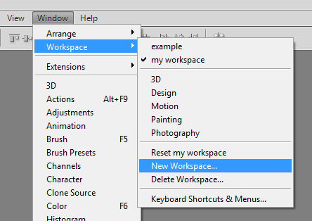
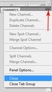
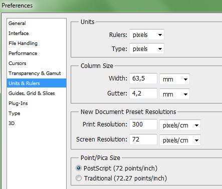
paste the following code): In the browser, the page will still be empty, but the structure of the document can already be understood, it is ready. Now let's move on to the CSS styling to give the document the initial appearance. Open style.css and add the lines of code you see below. Removing padding and margins on the page by default: * ( margin: 0px; padding: 0px; ) We set the colors of links depending on user behavior (hovered, not hovered, visited) and remove the underline from links over which the mouse pointer is located: A:link ( color: #D72020; ) a:hover ( text-decoration: none; color: #FF0000; ) a:visited ( color: #D72020; ) We set up the basic design of the page: we set the background color and the background image (we set the horizontal filling for the picture), set the color, style and font size: Body ( background: #FFD723 url(images/back_all.jpg) repeat-x; font: 13px Tahoma, Verdana, Arial, Helvetica, sans-serif; color: #333333; ) Content block definition: #content ( margin: 0 auto; background: #ffffff; width: 786px; text-align: left; ) Now you can refresh the page. It is filled with a background pattern. So far the only visible change for which the property is responsible is background class body. There is a beginning, and now you can start laying out the main blocks themselves. Let's start, of course, with the header. Which, in turn, consists of blocks of a horizontal menu and a logo. First, let's set the general design of both header elements: text alignment to the left, white background and height 306px: #header ( background: #ffffff; height: 306px; text-align: left; ) This is how we got a kind of header space: a white rectangle on which its elements will be located. It would be logical to start working on a horizontal menu right now. This is what we will do, but before inserting it into the HTML, you need to prepare the CSS rules, otherwise it will look terrible in the browser. Let's make the first adjustments: set the left border to be 2 pixels thick, the width and height of our menu, as well as a background pattern repeating along the X axis: #menu ( border-left: 2px solid #ffffff; width: 779px; height: 80px; background: url(images/header_top.gif) repeat-x; ) The page in the browser will immediately transform and look like this. Now you can add the menu itself to the file index.html: By refreshing the page you can see that it actually appeared. Only the type of links leaves much to be desired. Let's set our own rules for them (alignment, width, color, boldness, etc.), and set the links to change color when hovered and return the underline that was removed throughout the template: #menu a ( float: left; width: 99px; height: 46px; display: block; text-align: center; text-decoration: none; color: #ffffff; font-weight: bold; font-size: 14px; padding -top: 35px; ) #menu a:hover ( color: #D72020; text-decoration: underline; ) Now the menu formatting can be mapped to the PSD template. Pay attention to how the design of the item changes if you move the pointer to it (the rules are responsible for this #menu a:hover). We already have the logo and it’s in the folder, all that remains is to add it to the page and format it with the rules. Both can be done using CSS, which we will not fail to do. #logo ( background: #ffffff url(images/big_pic.jpg) no-repeat; width: 738px; height: 146px; text-align: left; padding-top: 80px; padding-left: 40px; border-left: 4px solid #ffffff; ) The logo is inserted exactly in size. The only thing it lacks is text. Let's insert what's missing into the block logo file index.html to get: The text has appeared, but it also needs to be formatted. Based on the fact that a logo is almost always a link, let’s set the design for the corresponding classes. #logo a ( text-decoration: none; text-transform: lowercase; font-style: italic; font-size: 36px; color: #FFFFFF; ) #logo h2 a ( font-size: 24px; ) There is no need to explain anything here; you are familiar with all the properties from CSS lessons. However, the appearance of the text has changed, and overall the header now looks even better than on the PSD mockup. Next, we set up the largest block on which all unique content will be placed. It will occupy 500px and be located on the right side of the site. Let's establish rules for positioning, design of headings, paragraphs and links (we have already talked about all the properties in articles on CSS). #right ( float: right; width: 500px; padding-right: 10px; ) #right h4 ( margin: 0; padding: 0px; font-size: 12px; color: #D72020; ) #right a ( color: #D72020 ; text-decoration: none; ) #right p ( margin: 0; padding: 0; padding-bottom: 10px; ) #right h2 ( margin: 0; padding: 0; padding-top: 10px; color: #D72020; ) Since we have only fixed the width of the block, there will be no visible changes until we fill it with content - the page height will change depending on the content. Let's fill the container right. We will place the images in a simple table. The content has received markup, but it clearly lacks a white background, which will not appear fully soon. During the layout, but after drawing the layout, it turned out that the side menu will still have sub-items, and they should appear when you hover over the main item and disappear when there is no pointer on it. Situations when you have to modify the design “on the fly” occur quite often. The distance between the menu and the main content allows us to insert sub-items, but the trick with the disappearance and appearance of submenus is interesting. In the CSS file, add the following code. #left ( padding: 10px; width: 237px; padding-right: 1em; ) #left h3 ( width: 225px; height: 25px; font-size: 14px; font-weight: bold; padding-left: 15px; padding- top: 15px; text-transform: uppercase; color: #ffffff; background: url(images/title.gif) no-repeat ) #left ul ( margin: 0; padding: 10px; list-style: none; width: 100px ; font-size: 18px; ) #left li ul ( position: absolute; left: 90px; top: 0; display: none; ) #left ul li ( position: relative; margin-bottom:20px; ) #left ul li a ( display: block; text-decoration: none; color: #ffffcc; background: #ff9900; padding: 5px; border: 1px solid gold; border-bottom: 0; ) #left li:hover ul ( display: block; ) #left li li ( margin-bottom:0px; width: 150px; ) #left p ( padding: 10px; border-bottom: 1px solid #D72020; border-left: 1px solid #D72020; border-right: 1px solid # D72020; ) Pay attention to class rules ul And li- The secret to the disappearing menu is there, discover it yourself. Let's first add an information block without a menu to the left container of the HTML document. We offer you holiday discounts. Further... The white background spread further down the page. Now is the time to paste the left panel menu code into the HTML file. It, unlike the top navigation, is implemented with lists, which can be seen from the CSS rules. Where does the layout process usually begin? It begins with studying the layout or layouts of the future site. Most often, these layouts are created in Adobe Photoshop, so you, as a layout designer, must be able to use this program, namely, be able to cut images from the layout, measure the space between elements, calculate the sizes and parameters of various components of the future web page, etc. First of all, let's set up the workspace in Adobe Photoshop for ease of work. All examples will be shown in the program Adobe Photoshop CS5, with an interface in English. When you open Adobe Photoshop, you will see something like this: We need to configure a set of additional panels. To get started, go to the menu Window – New Workspace: Enter a name for the new workspace, for example, my workspace, and press Save. Now we need to select the necessary panels to work with. Go to Window and check the boxes next to History, Info, Layers, Navigator, Options, Tools. You can uncheck the remaining panels if they are checked. Now we need to secure these panels. To do this, click on the top of the panel and drag it to the desired location so that your workspace ends up looking like this: When a blue transparent strip appears, release the cursor to dock the panel at that location: To close unnecessary tabs, click on the icon in the upper right corner of the tab, and select the item from the drop-down menu Close: The first layout that we will create is called simple_text.psd, it is located in the folder templates. Open it in Adobe Photoshop by holding down the keys Ctrl+O(or via menu File – Open), and select the file. Turn on the ruler using hotkeys Ctrl+R or through the menu View – Rulers: Now double-click on the ruler and open the tab Units & Rulers to set the units of measurement. Select in block Units For Rulers And Type units of measurement pixels: Now everything is ready, you can start making up the layout. Create a folder on your desktop and name it simple text. In this folder create two files index.html And style.css. As you remember, we create the structure of a web page in HTML. So first we open the file index.html, and write the original code in it:
Now between tags
Tag Let's write in this block the elements that are present on the layout, namely the heading and paragraphs:
Add text between these tags yourself. Now in a container
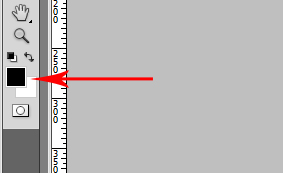
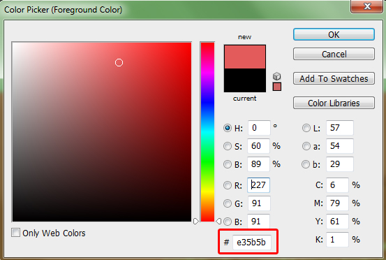
If you open index.html in the browser, you will see a web page written in pure HTML. It is very different from the one shown on the model. We'll fix this with cascading style sheets. Open your style.css file and reset all padding using the universal asterisk selector: * ( margin: 0; padding: 0; ) Now let's write down the properties for the tag Body ( background-color: #e35b5b; font-size: 16px; line-height: 24px; color: white; font-family: Arial; ) How to find the background color of a web page in Adobe Photoshop? To do this, click on one of the two squares with a color: Then click on the background of the layout with an eyedropper and copy the hexadecimal code presented in the window Color Picker: How can I find out the size, line spacing, style, font family and color of text? To do this, select the layer with the text, then open the panel Character. This panel will display the following options: Please note that for the text color, instead of a hexadecimal code, we wrote the hue name: color: white; . It is convenient to use shade names for black black and white white, since the name is much faster to write down than a hexadecimal code. All names of color shades can be found in this table. For this block, we will specify the width, as well as the top, left and right padding: For many properties you will see values written in the following formats: In the first case we specify values for each of the four sides, for example, margin: 10px 12px 20px 15px; : 10px – top padding, 12px – right padding, 20px – bottom padding, 15px – left padding. This notation is usually used when the indents on each side are different. In the second case three values are written, for example, margin: 10px 12px 20px; : 10px – top padding, 12px right and left padding, 20px – bottom padding. This notation is convenient to use when the values on the right and left are equal, but the values on the top and bottom are different. The auto value is used when you want the browser to automatically calculate left and right padding. In the third case two values are used, for example, margin: 10px 12px; : top and bottom margin 10px, right and left margin 12px. If the indents above and below are equal, and the indents on the right and left are equal to each other, then it is convenient to write down only two values, as in our example. In the fourth case one value is written, for example, margin: 10px; : padding on each side is 10px. When the parameters are equal on all sides, it is convenient to use just such a notation. How to measure the width or height of an element in Adobe Photoshop? Let's consider one way: take a tool Rectangular Marquee Tool (hotkey M): Then we select the area, for example, we need to find out the indent from the top edge of the layout to the beginning of the content, select it: In the panel Info look at the height values H, or width value W if you need to know the width of an element: Here we need to specify the size, line spacing, shadow and bottom padding. You already know how to register the first two properties. To specify the shadow we need the property text-shadow: How to find out shadow parameters in Adobe Photoshop? Select the desired layer in the layers panel and click on the icon ƒx: A window opens Layer Style. You need to select a tab Drop Shadow: Here's the parameter Opacity responsible for transparency, parameter Distance is responsible for the indent along the Y axis, parameter Size is responsible for blur, and the parameter Angle is responsible for the offset along the X axis. Since our shadow falls at a right angle, the offset along the X axis will be zero. The color of the shadow can be found in the box opposite the parameter Blend Mode: The color value in RGB format and with an alpha channel in this case will look like this: Text-shadow: 0 1px 0 rgba(0,0,0,0.3); It remains to write down the indentation below. If you need to write a value for one of the four sides, then use this notation: Since we need to specify the bottom margin, we’ll write margin-bottom: 30px; As a result, we get this code in the file style.css: * ( margin: 0; padding: 0; ) body ( background-color: #e35b5b; font-size: 16px; line-height: 24px; color: white; font-family: Arial; ) div ( width: 724px; margin : 43px auto 0; ) h1 ( font-size: 60px; line-height: 62px; text-shadow: 0 1px 0 rgba(0,0,0,0.3); margin-bottom: 30px; ) Let's write down the properties for the first paragraph: P ( font-size: 24px; line-height: 30px; color: #a42727; text-shadow: 0 1px 0 rgba(255,255,255,0.35); margin-bottom: 42px; ) Now if you save your changes and open the file index.html in the browser, you will see that these properties are applied to all paragraphs on the page. Since we need to write down these properties only for the first paragraph, in this case we can use adjacent selectors. What it is? In the html template, tags (let’s take the first paragraph) go one after another, which means they are adjacent tags; in CSS, adjacent selectors are written like this: H1+p ( font-size: 24px; line-height: 30px; color: #a42727; text-shadow: 0 1px 0 rgba(255,255,255,0.35); margin-bottom: 42px; ) Now, these properties will only apply to the first paragraph. Now let's move on to the last paragraph. Since it also differs from the main text, we will assign a class for it. In the html template, write the class attribute for the last paragraph with the value last-p . The name of the class, as well as the identifier, must begin with letters of the Latin alphabet: In CSS classes are written like this: P.last-p ( color: #ffbfbf; text-align: right; text-shadow: 0 1px 0 rgba(0,0,0,0.3); ) These properties will only work for the last paragraph in our template. Unlike identifiers, you can use a class with a specific value on the page as many times as you like. The text-align property with a value of right is used when you want to align text to the right. You can also use other values, for example, text-align: center; in this case the text will be aligned to the center of the block. For the remaining paragraphs we write the following property: P (margin-bottom: 30px; ) The remaining properties: color, font family, size, line spacing, this tag will inherit from the parent element, i.e. tag If we make the browser window smaller, we can see that the content is tacked to the sides of the window. To fix this, add padding to the div selector: If several elements of a web page contain the same properties with the same values, for example, as in our example, the title and the last paragraph have a common property - this is a shadow, then you can group these selectors by writing them separated by commas: H1,p.last-p ( text-shadow: 0 1px 0 rgba(0,0,0,0.3); ) Don't forget to remove properties from individual elements; in our case, you need to remove the shadow from the h1 and p.last-p selectors. Page layout is the process of developing the structure of an HTML document, the result of which is a web page. The structure of a web page is determined by the corresponding HTML tags. Tags - rectangular container blocks for content - do not appear in the browser window. They tell the browser about the type of content, and the browser, based on this information, displays their content - text or media files. To create a page layout, you need to select the main sections (sections) of the document. You can read more about sectional elements in the article. A standard web page contains the following sections:
We will not use the element Elements


Table-based layouts
). However, the element
It is not designed for creating page layouts, its purpose is to display tabular data.
The following layout is created using a table consisting of 3 rows and 2 columns, where the rows containing the header and footer content span both columns using the attribute colspan:
Example: Layout based on a table
Site header
Main menu
Main content...
Copyright © 2017 site
DIV-based layouts
Example: DIV-based Layout
Site header
New Layout Elements in HTML5
Preparatory stage
Divide the document into blocks
Setting up basic formatting

Designing a horizontal menu


home
Gallery
Agreement
Price
Samples
Contacts


Customizing the logo

Site name
Site slogan


Layout the main part of the page
Gallery
Kitchens


Creating a Left Panel
Information
Menu


Creating a Web Page Structure
Web page styling

Properties for the block


Let's go to the title


First paragraph. Adjacent selectors
And
Last paragraph. Classes in CSS
Other paragraphs
Grouping selectors
Video for the lesson
Part 1
How to create a page structure using blocks (block layout)
1. How to break your page layout into sections
 Rice. 1. Main sections of the page