Placing an order in your online store. Analytics of the order submission form
The purpose of the lesson
Develop a part of the service form template responsible for the order checkout page.
Get acquainted with the forms for choosing a payment method, delivery and the buyer’s questionnaire.
primary goal
The main purpose of the checkout page- be filled in by the visitor. Questions that users encounter when filling out forms:
Questions
- Where to begin?
- Is it easy to fill out the form? And how long will it take?
- Which payment/delivery method is right for me?
- How many steps do you need to complete before the form is completely filled out?
- Why should I fill out these fields? Why do they need this data?
- Can you be trusted? Will my email/phone number not fall into the hands of spammers?
- What should I do after submitting the form?
Tasks
Let's see what tasks the checkout page solves.
| Task | Solution |
|---|---|
| Provide a simple, neat layout | To do this you need to add free space and also remove all unnecessary |
| Draw attention to form fields | To do this, we will add a different background to the box with fields and borders around the form. |
| Remove unnecessary fields | You will need to determine which fields the user must fill out so that the order can be successfully completed. Nothing unnecessary that might force the user to leave the checkout page |
| Overcome visitors' doubts | You can inform that the order can be canceled at any time. Or talk about the benefits of purchasing in your store: warranty, return or delivery conditions |
| Use active voice | Guide the user through the checkout process using active verbs. They can be used in page headings or in the explanation of order form fields |
| Specify the number of steps and time to place an order | This is done at the top of the page, before the user proceeds to the design. |
Now let's solve these problems.
Sample
Provide a simple, neat layout
Let's start with the most difficult one. This is what the default checkout page looks like:
To simplify the appearance of the checkout page, we need:
- Leave only the logo and site name at the top of the site. No links
- Change sidebar content. We no longer need to show a list of categories. We'll put a little help in the sidebar for those who place an order and a message that you can call if something doesn't work out
- Simplify the bottom part of the site - leave only the copyright system and the site in it

If desired, you can completely abandon the sidebar.
Find in the template of the service forms page the global block responsible for top part site (usually $GLOBAL_AHEADER$) and place it in the following construct:
logo_simple.png is a simplified logo image. There are several ways to simplify the logo for the checkout page - reduce it in size, redesign it, leaving the corporate style, or make it black and white.
Let's do the same with the bottom part of the site ($GLOBAL_BFOOTER$) and the sidebar ($GLOBAL_CLEFTER$):
If you are experiencing difficulties with global blocks, remember.
Draw attention to form fields
In total, on the ordering page the user is asked to fill out four forms:
- Form with order contents (table) $BODY$
- Delivery method selection form $DELIVERY_SELECTOR$
- Payment method selection form $PAYMENT_SELECTOR$
- Personal data entry form $ORDER_FIELDS$
In order to highlight form fields, you need to configure .methods-list and #order-table:
Methods-list, #order-table ( margin: 20px; background-color: #e5e5e5; border: 1px solid #cccccc; )
Remove unnecessary fields
Here we are talking about the personal data entry form $ORDER_FIELDS$ . Surely, you have already completed lesson 31 about order fields. We will need to look at each added field under a microscope and ask ourselves: “Is the information in this field really so important to us that we are willing to lose some customers for it?”
Often, “Name”, “Phone Number” and “Delivery Address” are enough.
Of course, it is worth considering the marginality of goods. In stores where a large number of orders have to be processed, additional fields will increase profits by reducing labor costs for processing. In the case of a small flow of orders, it makes sense to request only the name and phone number, mainly relying on the qualifications of sales managers.
Once you have decided to remove unnecessary fields or add new fields, return to Lesson 31.
Overcome visitors' doubts
How we will overcome:
- After the form with the contents of the order $BODY$ we will place brief information about the guarantee and return conditions
- Next to the form for selecting payment methods $PAYMENT_SELECTOR$ we will place icons of attestations, certificates (if any) or icons of payment methods;
- Before the "Place an order" $ORDER_BUTTON$ button, we will inform you that the order can be canceled/changed at any time. This way the user won’t have long thoughts about “Did I format everything correctly?”
- Under the “Place an order” button $ORDER_BUTTON$ we will place a block “What will happen next?”. In it we will inform you that before delivery of the order, we will definitely call you back to clarify at the specified time.
Unfortunately, within the framework of this lesson we cannot consider how to add icons to payment or delivery forms. So just add the appropriate block after $PAYMENT_SELECTOR$ .
Use active voice
Let's look at a specific example. By default, choosing a payment method is described in this section of the template:
Payment method
$PAYMENT_SELECTOR$If you use active voice, then the same fragment will look like this:
Select a Payment Method
$PAYMENT_SELECTOR$The same applies to choosing a delivery method, checking the contents of the order and filling out the user data form.
Specify the number of steps and time to place an order
Before $BODY$ add a message about how many steps there are in the checkout process and how long it will take, for example:
Placing an order in 4 steps takes no more than 3 minutes
Where do uCoz have several steps to place an order? Here we are talking about steps within one page. I suggest this option:
- Step 1: Check the contents of your order
- Step 2. Select a shipping method
- Step 3. Select a shipping method
- Step 4. Provide information about yourself
Please note that the title of each step uses the active voice.
This concludes the lesson. There are a number of settings for the checkout page that will allow you to increase conversion on it. We will talk about this in the following lessons.
Exercises
- Create a simplified checkout page layout
- Remove unnecessary fields and select the remaining ones
- Place blocks with text that will help overcome buyer doubts
- Specify the number of steps and time required to place the order
Good examples were selected according to usability principles. It is also worth noting that some examples are unique and will not be suitable for every site. Always test and improve elements on the checkout page.
If there are doubts about the approaches - .
What makes ordering enjoyable?
Easy to use. While users do not have an account, they must enter their address and payment information to place an order. A good form should simplify this process: enter as little information as possible from the keyboard.
Useful features:
- Address search or predictive text input.
- Copying the delivery address to the payment information address.
- The request to create an account appears at the end when the user is ready to make purchases.
- Placing an order without registration.
- Clear error messages so that the user can quickly fix them.
Sources of problems:
- Forced registration before placing an order.
- Too many steps.
- Unnecessary form fields.
- Unclear error messages.
- Problems with form confirmation. For example, strict time format rules.
Best examples of checkout forms
Domino's
Domino's website has placed an emphasis on mobility. It recognizes device types and adapts to them.
The order form is nice and easy to use: no registration, simple fields to fill out, saved payment information for repeat customers.
Even if the user forgets the password, but uses the same email address, he will still be able to place an order. In such situations, many sites simply return the registration form asking you to reset your password. And this is not always convenient.
They also have an app where you can order with one click. Just open the app, wait 10 seconds, and your pizza is sent to you.
Lowe's
Registration can become an obstacle to making purchases. This extra step before placing an order may be overwhelming for many users.
On the other hand, registration allows you to simplify the purchasing process in the future. It is also convenient for users
Offer to register at the end of the checkout process. You can register on the Lowe's website before clicking the 'make an order' button. There shouldn't be any difficulties here.

Threadless
Excellent ordering form. The user is immediately taken to a page with a shopping cart and payment details. You can place an order without registering, by the way.
The entire order form is on one page. And it's very convenient.

Amazon
It's easy to make repeat purchases on Amazon. Of course, first you will have to fill out information about yourself, but then Amazon will remember them once and for all.
This minimizes the number of clicks and steps. The process from adding an item to your cart to confirming your order takes three steps. Not everyone can handle that much. Plus, spontaneous buyers will disappear.

The checkout form on their website has a great design. One improvement they should make is to make the checkout form stand out from the rest of the content on the page.
There is a progress indicator, total number of products, price and delivery terms. You can also enter the address using autofill, which is very convenient.

Schuh
Their team understands the importance of usability and is constantly improving it.
Look at the screenshot below to see the beauty of this page:
- Safety. At the top is a confirmation that the page is secure and the company's contact information.
- Notification about delivery and return of goods. Three points above the checkout form remind users of good delivery conditions, discounts and an easy return process.
- Progress indicator. Helps users understand how many steps to expect. And the fact that there are three of them already suggests that this is a fast process.
- Easy registration. Schuh is not interested in registration at this stage, he will offer it later.
- Links to important information. You don't need to make these links at the bottom too noticeable, but they should be there if the user needs them.
- Payment Methods. A visual reminder of how users can pay for their order.
- Centered shape. There are a few distracting elements on the page, but the focus is on making a purchase.

Crate & Barrel
The form has a beautiful and simple design. Everything is arranged logically, every field is marked. There is a progress indicator and there are no distracting elements on the page.

Nordstrom
A good example of a one-page order form. It has one advantage - it seems to the user that placing an order is much faster. And it doesn't matter whether it's true.
Nordstrom's website has information about the product and its price, plus empty fields are highlighted in red so the user doesn't miss anything important.

Superbalist.com
This site I made the registration form in the form of a novel - as soon as the user adds an item to the cart, he is prompted (in the form of a pop-up window) to create an account using email or a Facebook account, or log in to an existing one.
The user is then asked to create a password before continuing. 
After that, it is sent to a beautiful checkout form (although this is not very convenient for users who want to add more than one item to the cart).
What’s noteworthy is that the Superbalist website adds a lot of small text that explains the delivery terms and what to enter in the fields.

AO.com
AO.com did a good job. On this page you can select the time and date of delivery, and it’s very easy:

The payment page is great. The order amount, delivery date, quantity of goods, etc. are displayed. AO left his contact information so that any user can call immediately if he has any questions.

Joseph Joseph
Another site with a beautiful design of the order form - Joseph Joseph . The page that was chosen as an example is the registration form/checkout without registration.
What they do right: give the customer choice. Some will want to register, while others will not, and they will have the opportunity to place an order without additional procedures.

Good examples, but there is room for improvement...
Zappos website is a good example, they focus on customer service and loyalty.
However, the checkout process is not perfect. Creating an account is a mandatory condition that will not suit all users.
Perhaps in the case of Zappos, brand reputation removes this barrier. I wonder if they tried something different.

After registering, users are redirected to the cart page, which is not very convenient.
In addition, the order form is not highlighted. It gets lost in the background of the main navigation menu, search bar, alphabetical index, etc. There are too many distracting elements that will make users reluctant to place an order.
Highlighting your checkout form doesn't mean luring users in, it means making it easier for them to buy.

Boots
This checkout form is the worst one out there.
What's bad here: the user must write his address twice - when filling out payment information and delivery information. Using the same default address is a good way to reduce form filling time, which many sites use.

Conclusion
The forms may not be similar to each other, but each of them has useful features that you can use when creating your website.
What do each of these forms have in common? They aim to make things easier for users. For example, when you want a user to register, it's better to add one or two steps at the end of the checkout rather than at the beginning.
Do you have any examples of checkout forms that are better than those presented? If yes, share them with us in the comments below the post...
We at WordFactory believe that what we sell is not ornate word structures, headlines that are not strikingly creative, or creative ideas, but information. If you find out everything that interests a potential client and answer all his questions, you will receive a sales text. What does the reader want to see on the “Delivery” page?
Delivery methods. Obviously? Trite? Logical? I completely agree. But the text about delivery often does not say that store employees are ready to send the parcel in any way, including transfer by minibus. Some people think that the possibility of self-pickup is something self-evident and do not write about it at all. So if you are one of those site owners who want “Rozetka-like”, start with the “Delivery” page, like Rozetka’s:
- 5 delivery methods;
- names of options and courier services;
- short and extended descriptions;
- easy-to-understand visual design.
Beauty isn't it? They didn’t even forget to write about...
Pickup– a point that goes without saying. Those stores that provide the opportunity to independently pick up goods from a store, point of delivery or warehouse believe that this is already understandable, so they do not write about it at all. And only a few understand that this is both a benefit for the online store itself and an advantage for many potential clients. For example, here's how city.com.ua explains why pickup is cool for a client:

Example. We urgently needed a laptop for a new employee. The required model was sold in dozens of stores, but it was possible to pick it up right today, without waiting for delivery tomorrow or the day after tomorrow, in only one - we chose it.
And another good example. The website http://jysk.ua/ immediately shows where you can pick up the product you see in the online store.

During a standard night of online shopping, not only did I choose an excellent set of bed linen, but from the very morning I gave my husband precise instructions on where to go to pick it up.
Carrier companies. You can briefly write “we deliver by courier services,” or you can indicate all the carriers with whom you are ready to work. Large online stores, as a rule, sign special agreements with one or two large delivery services, while online stores with a small flow of orders are ready to send goods in any way convenient for the client.
I know that the nearest Novaya Poshta branch is located in the next house. Therefore, if two online stores sell the same product at the same price, I will choose the one that works with Nova Poshta. If I need to order an orthopedic mattress with home delivery, I would completely agree with Mist Express. But in the village where my grandmother lives, the only option to receive a parcel is Ukrposhta. Therefore, which delivery service an online store works with is sometimes a matter of convenience, and sometimes it is the answer to the question of whether or not to order here, in principle.
Delivery to your door. To the door of the entrance or apartment on the 12th floor? Does the delivery cost already include the ascent to the 12th floor? An elementary question with no unimportant nuances.
Example. I weigh 53 kilograms. Cast iron bathtub - 96. I believe that “delivery to the door” means delivery to the door of the apartment, and the courier of an online store means the entrance door by “door”. Question: what to do now with a hundredweight of cast iron?
Delivery with fitting. Only after leaving the maternity hospital does a woman truly understand not only what “nothing to wear” means, but also “no time to go shopping.” It was in this situation that the online store http://musthave.ua/ really helped me out. Their wonderful courier delivers the goods to your home, and he is the only man in the world who can patiently endure a half-hour trying on one dress. This service costs nothing if you buy at least one unit of goods, and if nothing fits, pay only 50 UAH. Dear MustHave, you are really cool! Hint: Add information to the "Delivery" section. You do something so simple and so priceless that it makes sense not only to talk, but to shout about it!

And an anti-example. The store, which we will not name, is also a Ukrainian manufacturer of the most beautiful (judging by the catalog) dresses, operates only in the format of a closed showroom. You need to agree on the fitting in advance (I agreed twice, but the fitting was postponed twice because the goods did not arrive and did not arrive). You can also send someone and pick up dresses for fitting, paying 100% of the cost.
Prompt delivery. Delivery time depending on the chosen method is another super-important thing for making a purchasing decision. And this is also a way to speed up the client’s decision-making (“Order today before 17:00 - and you will have the product tomorrow”). In addition, this can help focus the client’s attention on the delivery method that is most convenient/profitable for the online store (“Order delivery this way and receive your parcel today”).
The heating season begins on October 15. But it always gets cold in the apartment much earlier and always suddenly. For many years now, somewhere in between these two events, I have been ordering the thinnest, warmest, most pleasant-to-touch thermal underwear from a Nikolaev manufacturerhttp://kifa.com.ua/ . The coolest thing is that I always know: my order will be delivered exactly within one business day. And this means that tomorrow I will be warm and comfortable, no matter how many more days the mayor will advise to “get ready to hit the ground.”

Payment by cash on delivery. It will be useful for the client to know that:

And again an example, and again Rozetka. When placing an order, I learned from the operator that when paying by cash on delivery, no commission is charged. It was just a nice bonus, since the purchase cost was small. But when ordering an expensive product, for example, a Macbook Pro for 90,000 hryvnia, a savings of 2% (1,800 hryvnia) would be very noticeable. And, unfortunately, they were modestly silent about this on the “Delivery” page.
Exchange and return. This is one of those items that is often published on other pages of the site: “Order conditions”, “Payment”, etc. But the awareness that the product can be easily exchanged can be an additional incentive to buy “here and now”, especially if the client needs get 2 sizes of one dress to make a choice, or the product is expensive and the client does not dare to make a purchase right away.
And againMust have. When ordering goods at home with fitting, you can immediately buy the things you like, and give away everything that doesn’t suit you right away. All! But in another store, which I already wrote about, you can order delivery by courier or ask someone to pick up the items by paying 100%, and for some reason you can return dresses that did not fit only by sending by Nova Poshta and expect a refund in within 2 weeks.
Permanent courier.My husband was annoyed with the delivery for a long time.https://www.eden.com.ua/ . Not only did the couriers appear on our doorstep at 7:00–8:00, as agreed, but they also looked indecently fresh, cheerful for such an early time, energetically carried heavy bottles of water, released some joke and, shouting “Shiro dyakuyu!” at the top of their lungs, they hurried on. What infuriates my husband even more is that for some reason we have now been replaced with a delivery team. There are no complaints about the new guys, but no jokes, no humor, no enthusiasm, no mood for the whole day - we just got used to the previous team.
For services that require frequent deliveries (water, dry cleaning, ironing, diet food, detox menu), a “personal” courier is a big plus: he already knows your wishes, he is a member of your home, he prevents misunderstandings if the operator made a mistake when accepting your order (for example, you ordered delivery at an unusually early time for you).
http://ytuzhka.ua/ – ironing and laundry service. Just imagine that you no longer have to stand every evening and iron your husband’s shirt. You no longer need to blush in front of people because your husband has two arrows on his trouser leg. There is no need to buy a new blouse because I burned through my old one when I found out that Ronaldo is gay. And the best part: the things dear to your heart are always picked up and returned by the same courier, so “native” that the concierge and neighbors greet him.
Assembly, installation upon delivery. And one more important thing when ordering large purchases, furniture, equipment. The cost of goods in the largest online stores in the country is often higher than in small shops. At the same time, the largest ones often include assembly, installation and debugging in the delivery cost. For some product categories this is an important advantage.
Do not call back to clarify order details. I sincerely don’t understand why, but for some clients it is extremely important that they are not called back to clarify the details of the order. What is the problem if the operator dials you and, just in case, double-checks whether you indicated the correct number of bottles of water? But still, if your target audience is paranoid about this, it’s better to know and indicate this option.
So, the checklist for the “Delivery” page:
- Have you indicated all delivery methods? Exactly? Even those that go without saying, for example, pick-up from a showroom, store or warehouse?
- If you offer self-pickup, have you provided clear instructions about where and at what time the item can be picked up? Have you added landmarks? Have you loaded the map?
- Have you provided a complete list of shipping companies you cooperate with?
- Have you covered all the important details about “delivery to the door”: to the door of the bathroom/apartment/entrance/city gate?
- Is it possible to try on/test the product upon delivery before payment?
- Is there a possibility of prompt delivery? What does “promptly” mean in the case of your product? 30 minutes for pizza delivery? Laptop within 24 hours? New iPhone straight from the States a week after the official presentation?
- Payment by cash on delivery: is it possible, are there any special conditions, for example, no commission?
- Is it easy to exchange or return the goods? Where and how should it be sent if necessary?
- Is a permanently assigned courier important to your client?
- Will the product be unpacked, assembled and installed upon delivery?
- Is your target audience paranoid about follow-up calls?
- Are there any shipping methods that are most beneficial for your store? For example, sales happen faster if customers use curbside pickup. Or the order processing cost is cheaper if it is delivered by a certain courier service.
- Have you indicated all the customer benefits of a particular delivery method (can it be delivered faster or cheaper)?
What are the specifics of delivering your product (for example, is delivery into the apartment, assembly or installation important for the client)?
Friends, greetings. I deeply apologize for the fact that over the past two months I have only two articles. The simple fact is that at the end of September my son was born and I am just now slowly getting used to the new rhythm of life.
Today’s article is on the topic “ Take it and implement it quickly!”. And, it would seem, what does the sheet in the picture on the left have to do with it? You'll find out soon
And today I want to touch on a topic related to the text and graphic design of pages with delivery information. After all, this is one of the few pages that forms the visitor’s final decision about purchasing in your online store, and many simply underestimate its importance.
I have seen so many options for presenting this information, and I am increasingly convinced that imagination is not limited by anything.
What we'll talk about:
- Formulation of the problem;
- How NOT to do it;
- Simple presentation of information (choose your implementation option);
- Good role models;
- Conclusion.
Why is this so important anyway?
It is not for nothing that I draw your attention to the “Delivery” page, since by reading these pages, the visitor often makes the final decision to buy from your online store or not. And our task is to make this reading easy for him and not cause difficulties. Don't underestimate content marketing (which is something that gets a lot of attention in mine), even on the shipping page.
When the question arises about presenting this or that information, we immediately begin to think about how best to do it.
For example, in every article on this blog I struggle to restrain myself from oversaturating my readers with information. After writing, I edit almost any article several times and reduce the amount of information provided for better assimilation and minimizing the mess. Yes, writing each article takes about 10 hours in total, but I’m sure it’s better than publishing a semi-finished article every day.
Therefore, every time you get ready to go to the site, post some information page (speech doesn't work about articles on the online store’s blog), then try to fit maximum information in a minimum of words or, even better, graphics.
And today we will try to put this information in such a way that with just one glance the visitor will understand that you are successfully delivering the goods to his city or village.
Bad example
Not the best example to follow.
To the left of this text you see a screenshot of the “Delivery and Payment” page from the ProSkater.ru website, reduced several times.
Most likely, this page was updated as information became available and new directions in delivery were discovered, but when the page is more than 13,000 pixels high (more than 10 screens long!), this no longer seems funny.
In this case, this online store can afford this, since it already has a huge army of buyers and followers who already remember by heart all the conditions and rules for delivery with payment.
The first example clearly shows the most common mistake when compiling this type of page: putting in as much information as possible and getting unreadable sheet of text.
Summary: don’t lump everything into one pile, structure the information!
But these are all general tips that mean nothing until we get down to business. In the next chapter, we'll start building the backbone of this page and find some really worthwhile solutions.
Simple presentation of information
Each online store has its own types of delivery and there is simply no single solution that will cover all options.
Let's look at the most common options:
Same rules for everyone
First impression.
At the first glance at the “Delivery” page, the visitor should immediately have an understanding of whether you are in his city or not.
If you have fixed or even free delivery throughout Russia, then this elegant solution will suit you (live example at the end of the article):

It’s easy to guess that just one glance at this page will make it clear that the online store provides delivery throughout the country and absolutely free. Yes, you can write about this in text, but with an image it’s much more effective, and visual users will also appreciate you
Call to action!
At the end of the page, be sure to place a link or button calling for further action. Usually this is a simple link with the text “Proceed to Shopping” that leads to the main page.
Option #1. Courier only.
If you only have courier delivery to your own and additional cities, then it is often enough to simply list these cities in the description text.

When a user lands on this page, he immediately sees a map with cities marked on it. And if he sees his city, then his gaze falls below, where there are already links to detailed conditions for each city, which are located on the same page just below.
If you decide to use interactive Google maps, it makes sense to use Info Windows for Google Maps. Example:

In each city where courier delivery is available, place a similar marker and in the pop-up window you can place any information: delivery speed, delivery time and other conditions. You can read more about the Google Maps API.
Fortunately, few online stores work only with courier delivery and usually there are significantly more types of delivery. In the next example we will add .
Option #2. Courier and pickup.
If you work with both courier delivery and pickup throughout the country, then I suggest slightly modifying the first option.

In this case, you can most likely also get by with a text page with an interactive map at the very beginning.
Again, once visitors land on the page, they will see an interactive map with cities marked on it. By clicking on his city, the visitor can immediately see what options are available for him: courier, pickup, or both.
Option #3. Courier, pickup and mail.
You understand that it makes no sense to place all post offices on the map and some other solution is needed here.
Changes:
- When landing on the delivery page, the user should immediately understand that delivery is carried out throughout Russia;
- Let's immediately separate Postal delivery from other methods. And to do this, we will divide the information into tabs.

The first tab “Courier delivery and pickup” is completely taken from option No. 2. But the second tab is fully prepared for Russian Post:

Those who live in remote regions know that mainly only Russian Post delivers to them. And that’s why we immediately suggest watching:
- Cost of delivery;
- Delivery terms;
- As well as delivery deadlines on the diagram.
That is, when you get to this page, we will answer the user’s questions on the first screen of the monitor. This is wonderful!
Other delivery schemes.
This article covers the general case, but still, each online store has its own delivery methods to the buyer and you can’t get enough for everyone at once
Therefore, here are some tips to help optimize the presentation of information:
- Key Recommendation: Use tabs to separate information. If you want to add a description of delivery by transport companies, it is better to place this information on a separate tab;
- From experience, the simpler the overall delivery scheme, the easier it is to work. Some introduce delivery calculators by Russian Post and persistently enter the weight of goods into , and some simply set a fixed cost of delivery by Russian Post. The average cost of delivery for both is approximately the same;
- Try to make sure that at the first glance at the delivery page the user immediately has an answer to his question: “Will you deliver to my city?”;
- At the end of the page, place a “Proceed to Shopping” link.
Some good examples
I think it would be nice to include some great examples of “About Shipping” pages at the end:
Ecco

The tab system in action. Link .
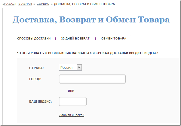
Here we have a slightly different approach. Just enter your zip code or city and the online store will display all possible delivery methods. Link .
Exclusivedog

Look how elegantly the delivery is described. Just looking at the banner, no other questions arise. Link .
Another confirmation of this is the scroll map of this page:

As you can see, for most users, a graphical display of delivery conditions is enough, and not everyone gets to the detailed delivery conditions. Moreover, in this online store they are very simple.
Conclusion
I strongly advise you not to neglect the “Delivery” page and complete it fully. This page is studied by almost everyone who wants to place an order in your online store.
Therefore, audit it and immediately use the recommendations from the article you just read. Do a good deed for your visitors